As one of the world's most successful offset printers focused on helping self-published authors and independent creatives develop the best possible print editions of their work, we're all-too-familiar with the most common design errors. Here, we share these rookie book design errors to help you avoid making them!

Choose your printer wisely
At QinPrinting we e know a lot about book design for self-publishers. We work daily with successful self-published authors and independent creatives who take on the responsibility for doing their own design work. Most of them have studied at least a couple of professional level courses, invested in the best desktop software, and have several years of experience under their belts. Others are just starting out. You need to be careful when sending print files to your printer. Without mentioning names, we know of printing services who will simply print whatever you send them without checking your files first. We would never do that. Quality control and personalized customer support is baked in to the way we work.
Our experts are always available to discuss your needs, offer advice, and support you in any other way possible to make sure that every aspect of your experience is both pleasurable, simple, and effective. We've also created a series of design templates to take some of the pain away before you even get started! Our in-house designers check every single file we receive and if they find any errors or issues, they'll contact you straightaway with a full explanation of what the problems are and a detailed step-by-step account of what you can do to fix them. But with that in mind, let's get down to the nitty-gritty. Here are the 10 most common pre-press and design errors we see from inexperienced self-publishing authors. Take notes and avoid them!
1. Where is the ISBN?
If you're used to publishing e-books straight to Kindle, you may not even be aware of the importance of buying and assigning an ISBN to the print edition of your book. The ISBN is a unique number which identifies the book, its title, its publication date, and you as the author and is registered with the relevant authority in the country in which you officially publish. In the US, you can purchase ISBNs from Bowker's and in the UK, from Nielsen's. This unique number allows for accurate tracking and marketing for your book and is necessary if you want to get it into the catalogs from which physical bookstore owners and others — such as libraries and schools — choose the books they buy. While there is no legal specification about where you should publish your ISBN, there are common conventions by which you should abide. So, your ISBN should appear with its barcode on the back cover of the book and in the bottom right-hand corner. When positioning the barcode and ISBN image in your layout, make sure to leave a 10 mm trim line from the edge.
2. Your market research is missing
A fundamental undertaking before embarking on any commercial project, including printing a book, is market research. Market research is a must for effective book design for self-publishers. Each genre or subject has essential design elements which have been established over many years and appeal to that audience. While there may be arguments for novelty and innovation in some areas, following industry standards and meeting consumer expectations is often the better bet from a commercial point of view. New market research will give you a lot of information about everything from the size of your book, the number of pages, and preferred typesetting and layout patterns to color schemes, image and artwork choices, and more. It's much easier to market a book, even if you're handling it all yourself, which visibly and easily fits instantly into a recognizable category. So, make sure thorough market research informs your design.
3. Cheapskating
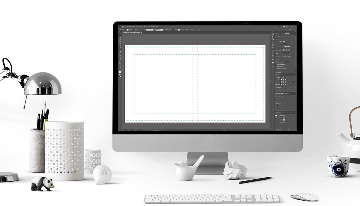
We understand that many independent creatives and self-publishers start out with a limited budget. But you need to work creatively within those limits; and that doesn't mean cheapskating. If you're going to design your own book, you really need to design it! It's no good just sending us a Word document, for example, and expecting us to turn it into a book. You need to invest in appropriate software — we recommend Adobe's suite of design applications, especially Illustrator and InDesign — and learn how to use it. Otherwise, if you have the resources, we strongly recommend that you outsource to a reputable third-party designer or design agency. Poor design or no design at all is a false economy. Why? Because it's a competitive marketplace and if you present your work in an amateurish fashion, it simply won't sell. Any expenditure made in improving book design for self-publishers is an investment in your future publishing business.
4. Illegal images
Many people think that if a quick Google search can find images, photographs, graphics, or artwork online, it's up for grabs. But nothing could be further from the truth. All images are automatically protected by international copyright law as soon as they're created. Using an image that you don't own or don't have full legal permission to use for commercial purposes, especially if you splashed it all over the front cover of your book, is not only illegal but could lead to serious and expensive litigation down the line. Pleading ignorance of the law is no defence. So, make sure any images you use are legally sourced, appropriately accredited, and paid for.
5. The "I-did-this-myself-in-less-than-5-minutes" book cover
Despite the common saying, everybody judges a book by its cover. The first thing any potential reader will see is the cover and it's the only thing that will decide if they pick up your book to read a few pages in store or click on the “Look Inside” feature online. Make sure that you design your book cover with care and attention and to the highest standard of which you are capable.
6. Not enough margin
We see this all too often. To allow for the area close to the spine, for layout, and pagination, not to mention footnotes in an academic work, you must leave sufficient margin around all printed areas. A good rule of thumb is 8 mm to 10 mm. Anything less may mean that your book is not readable, or the text appears crammed on the page, or the only way the reader can read it is by breaking the spine. So, always leave a good margin.
7. What page number are you on?
Oops! Don't forget to number your pages. Otherwise, unless your reader is going to read your entire book cover to cover in a single sitting, you'll make it hard for them to get back to where they left off! Proper pagination is vital for excellent book design for self-publishers.
8. Where are the page numbers?
Another common problem is that you remember to put the page numbers in, but you formatted and positioned them differently on different pages; for example, right and left pages in which one has the number in the top left corner and the other in the bottom right. Just don't do it. Make sure your pagination is clear and consistent throughout.
9. Inconsistent formatting
Designing a book is complex, especially if you wrote the book yourself. It becomes, after a while, almost impossible to see what you are doing. That's no excuse for muddling up the formatting. There is a single rule here: consistency. Whatever fonts, dividers, headings, sizes, and margins you choose, make sure they're the same throughout your text.
10. Tiny titles
Study book cover design not just for the artwork, but also look at the size and positioning of titles and the author's name. It's rare that you can get a free-with-your-word-processor font that will go big enough to look bold and eye-catching in a book cover. It's always worth choosing a font that is bang on, even if you have to fork out a few dollars for the right to use it. Tiny titles are obviously hard to read in a physical book and they become practically invisible when reproduced as thumbnails in online stores. So, make sure your titles are visible and legible to give your book the best chance of attracting a reader's interest.
Talk to us!
A QinPrinting, we've been printing successful books for self-publishing authors and independent creatives, not to mention businesses and non-profits, for over 25 years now. We've established an expert and enthusiastic team with a knowledge about book design for self-publishers that is both broad and deep. We also have our own specialist in-house designers. If you've written a book from start to finish, that's already a tremendous achievement. Don't let your book down by failing now in designing it for print. We have a range of custom designed book templates to help you get started and we are always happy to talk you through the nuts and bolts of good book design. Just talk to us. We are here to help. You can easily get in touch by telephone, email, the live chat, Skype, or the online contact form. We look forward to working with you.


