

Which color system is right for your print project?
Choosing the right color system for printing can feel a bit like stepping into a paint store without a shopping list—you know what you need in general, but you're overwhelmed by the choices and the jargon. If you've ever asked yourself, "Should I go for CMYK or Pantone for my next print project?" you're in the right place. In this post, we'll break down these two popular color systems to help you decide which is best for your particular needs, whether you're a business looking for flawless branding consistency or an individual wanting top-notch invitations for a private event.
Drawing on over 30 years of success in the industry, we'll guide you through everything you need to know to make the right decision with confidence. By the time you finish reading, you'll understand both the pros and cons of CMYK and Pantone and have a handy summary you can refer to whenever you're making printing decisions.
What are CMYK and Pantone?
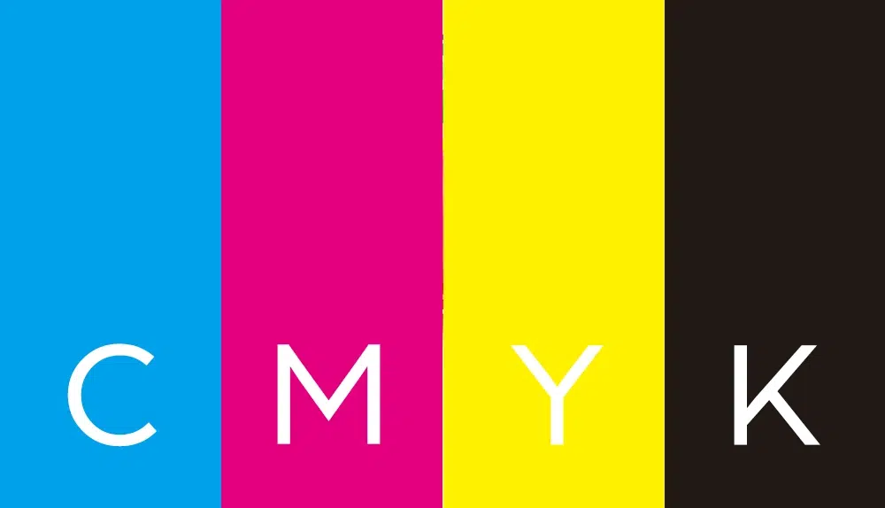
CMYK: A quick overview
CMYK stands for Cyan, Magenta, Yellow, and Key (which is black). These four ink colors are layered in various percentages to create a broad spectrum of shades. This is the most common color mode used in digital and offset printing because it's relatively cost-effective and versatile.
- Cyan = C
- Magenta = M
- Yellow = Y
- Key (Black) = K
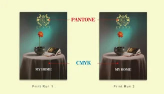
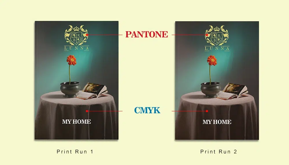
In the printing process, plates for each color are etched with the areas that will carry ink. When the press runs, the plates apply their respective colors one after another onto the paper. Because of subtle variations in ink density and the natural inconsistencies in print machinery, the final printed colors can vary slightly from run to run.
Pantone: The basics
Pantone (often referred to as PMS, which stands for Pantone Matching System) is a proprietary color space used in a variety of industries, primarily printing, but also in product manufacturing and fashion. Each Pantone color is mixed from pre-measured ink formulations to create a precise, standardized hue. Pantone inks are premixed to specific values before printing, guaranteeing color consistency.
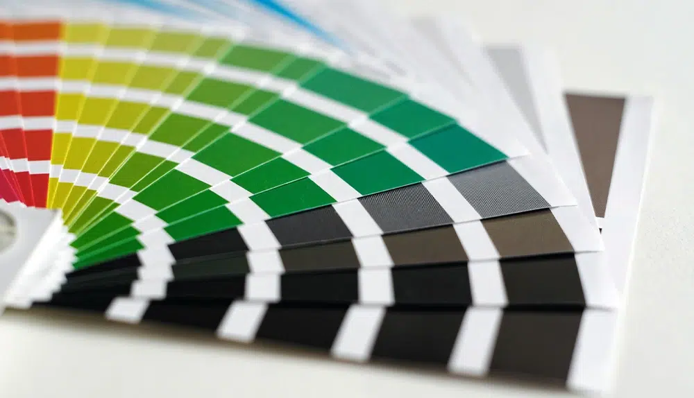
If you have a strict brand color that must always appear consistently—think of Coca-Cola Red or Starbucks Green—then Pantone is often the go-to choice for unwavering precision.
Advantages of CMYK
- Cost-effectiveness
CMYK printing typically uses four plates (one for each ink), and most standard printing setups are geared toward four-color processing. This makes CMYK more budget-friendly, especially for medium to high-volume runs. If you're printing thousands of flyers or brochures, the cost per unit is relatively low. - Wide availability
Because CMYK is the industry standard for full-color printing, you'll rarely have trouble finding a print service that offers it. From local print shops to large-scale offset printers like QinPrinting, everyone will be able to accommodate CMYK-based jobs. - Versatility
CMYK can reproduce a vast range of colors, making it ideal for photographs, detailed artwork, and designs that feature multiple colors. If your project has gradient shading, complex images, or a wide palette, CMYK is typically the best choice. - Ease of file preparation
Most design software—Adobe Photoshop, Illustrator, InDesign, and others—default to or readily support CMYK color modes. Converting from RGB (screen-based colors) to CMYK is also straightforward, although you should always do a test print or proofing to check for color accuracy.
When CMYK shines
- Multi-page catalogs loaded with product images
- Posters featuring complex gradients or photography
- Full-color brochures or magazines
- General marketing collateral and stationery

Disadvantages of CMYK
- Color variation
Because CMYK involves layering four different inks, even small differences in ink density, paper type, and press conditions can result in color shifts. While modern printing technology minimizes these variations, they can still occur, especially if the run is large or if you print the same file in multiple batches over time. - Limited color gamut
CMYK cannot replicate certain vibrant colors, like ultra-bright fluorescents or particularly deep blues and greens. That means if your brand color is very bold or neon-like, you may find CMYK printing can't quite capture it. - Ink coverage issues
If your design is heavily saturated with darker tones, you need to be mindful of total ink coverage, typically capped at around 300% to avoid drying issues, smudging, or paper warping.
Advantages of Pantone
- Unparalleled color consistency
Pantone colors are mixed using precise formulas, so the color you select is the color you get. If brand uniformity is critical—like a company that invests heavily in brand recognition—Pantone ensures that, regardless of printer or print run, your logo color always looks the same. - Specialty inks
Pantone offers a range of specialty inks, including metallic, neon, and pastel formulations. If your project demands a metallic sheen (like silver or gold) or an eye-catching neon highlight, Pantone has spot colors that can achieve that effect better than CMYK. - Efficient for single or two-color jobs
If you only need one or two colors for a design—like a branded tote bag or a minimalist business card with a single logo color—Pantone spot printing can be cost-effective and gets you perfect color results.
When Pantone excels
- Branding materials (business cards, stationery, envelopes) where color must be identical across all items
- Projects that require special finishes or metallic/neon inks
- High-end packaging or premium event invitations
- Artwork requiring precise color matching for brand integrity or artistic effect
Disadvantages of Pantone
- Higher cost for multi-color jobs
While Pantone can be cost-effective for single-color or dual-color jobs, once you go beyond two or three specific spot colors, the price can climb. Each spot color requires its own plate and often a separate press run, increasing both setup time and expense. - Limited in full-color photographic reproduction
Pantone is perfect for spot colors but not as flexible when it comes to printing photographs or designs with intricate gradients. You can use Pantone Bridge (which converts Pantone colors to CMYK) for photos, but at that point, you're essentially reverting to CMYK for that part of your design. - Requires specialized management and knowledge
To use Pantone effectively, you or your design team must know how to specify and manage spot colors in your files. If someone mistakenly converts a Pantone color to CMYK before sending it off to print, you won't get the color accuracy you're paying for.
Technical tips
- Color proofing
No matter which color system you use, always request a hard copy proof from your printer—like the offset proofs available at QinPrinting—especially for large or color-critical jobs. Digital proofs are helpful but may not capture nuances like paper stock and ink coverage. - Design software setup
In Adobe InDesign or Illustrator, you can specify Pantone spot colors from the built-in Pantone swatch libraries. Be sure you don't convert them to CMYK inadvertently unless you're specifically aiming for CMYK output. For CMYK projects, make sure your document color mode is set to CMYK from the start. - Paper choice
Pantone or CMYK can look slightly different depending on whether you print on coated or uncoated paper. Pantone swatch books are usually categorized into coated and uncoated versions, each with slight color variations. For CMYK, coated papers often yield sharper, more vibrant results, while uncoated can give you a softer, warmer finish. - File formats and bleeds
Always use vector-based formats for logos and simple designs to maintain clarity and color consistency. Make sure your bleeds (the extended edges of your design that go beyond the trim) are correctly set—typically 3 mm—to avoid white edges where the paper is cut. - Budget vs. consistency
There is a cost vs. consistency trade-off. CMYK is generally cheaper for large runs but with some color variation risk, while Pantone is more expensive for multiple colors but guarantees precision. When it comes to branding, sometimes the extra cost for Pantone is worth the investment for visual consistency.
Whether you're printing with QinPrinting or another professional printer, communicate your needs upfront. Most printing companies will guide you toward the best solution for your situation. It's not always a straightforward "CMYK vs. Pantone" scenario—some projects even combine them to get the best of both worlds.
At a glance: CMYK vs. Pantone
| Factor | CMYK | Pantone |
| Color Consistency | Good, but may vary slightly run to run | Excellent; specific spot colors ensure uniformity |
| Cost | Generally more affordable for full-color printing | Can be more expensive, especially for multi-color projects |
| Range of Colors | Wide, but cannot replicate some bright or neon tones | Limited to spot color sets, but can include specialty inks (metallics, neon) |
| Ideal Use Cases | Multi-color brochures, photos, large-volume prints | Corporate branding, logos, packaging, special effects, color-critical prints |
| File Prep Complexity | Straightforward; widely supported | Requires spot color management; easy to mix up if not careful |
Key Takeaways:
- Choose CMYK for versatility and cost-effectiveness, especially with photo-heavy designs or when you need to keep expenses down.
- Opt for Pantone if you have strict brand colors or want special inks such as metallic or neon.
- Always request a hard proof, check your paper stock, and discuss project details with your printer to guarantee the best results.
In the world of print, there's no one-size-fits-all answer to "Which is better, CMYK or Pantone?" Each system has its pros and cons. CMYK's strength lies in its versatility and affordability for full-color, high-volume printing, while Pantone excels at delivering precise and consistent spot colors—an essential for brand consistency or special design effects.
Talk to us!
If you're still unsure, don't worry. Just talk to us. At QinPrinting, we offer expert guidance. Feel free to reach out, provide us with your design files, your budget, and your goals, and we'll help steer you toward the ideal solution. Whether you're a business trying to make an unforgettable brand statement or an individual preparing to self-publish, you can feel confident and creative in your choice once you understand the difference between CMYK and Pantone.
Just shoot us an email to [email protected] or call us on +1 951 866 3971 and we'll be delighted to do all we can to help you.