Your business's annual report is a vitally important document. Getting the design and printing options right for your brand and for your stakeholders and investors is essential to your report's success. Here, we work through everything you must consider to get it right.
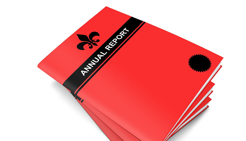
An annual report serves as a comprehensive reflection of your company's performance, achievements, and future outlook. It's not merely a document; it's a powerful tool for communication, branding, and investor relations. To truly make an impact, an annual report needs to be more than just well-written content — it must also be impeccably designed and printed.
In this guide, we'll take a deep dive into the essential considerations for businesses looking to print high-quality annual reports. From the content to include to paper selection to design elements, binding options to special finishes, we'll explore every aspect to make sure your annual report stands out and effectively communicates your company's story.
What content should your annual report include?
While the specific content of your annual report depends on the industry you work in and the activities, size, and composition of your company, typical components include the following:
Letter from the CEO: A message from the CEO or company leadership, highlighting key achievements and outlining the company's vision for the future. This may be as short as a single paragraph or as long as several pages.
Financial highlights: Summarized financial statements, including income statements, balance sheets, and cash flow statements, along with analysis and commentary on financial performance. Typically, this section will also include tables, lists, graphs, and perhaps flow-charts and other graphical elements.
Business overview: An overview of your company's operations, including business segments, geographic regions, and market positioning. Again, you may wish to include visual aids and graphical interpretations such as maps, infographics, and even word clouds.
Corporate governance: Information on your company's board of directors, governance structure, and adherence to corporate governance best practices. This is also the place to include any news relating to changes in the boardroom, any sub-committees, and ingoing and outgoing persons.
Corporate social responsibility (CSR): A section highlighting your company's efforts and initiatives related to environmental sustainability, social responsibility, and community engagement. This may include case studies, mission statements, and evaluations of goal achievements.
Management discussion and analysis (MD&A): Management's analysis and interpretation of financial results, business performance, and strategic initiatives. Possibly the heart of the report, this section should go into useful detail on all these aspects and explain the results of analysis with clarity and precision.
Risk factors: Disclosure of potential risks and uncertainties that could impact your company's future performance and financial condition. Don't shy away from this section. It demonstrates honesty and accountability in business practice while also keeping your stakeholders informed of vital information. Obviously, having assessed potential risk factors, you should also provide credible strategies to mitigate any potential problems, showing a positive and problem-solving approach.
Auditor's report: An independent auditor's report providing assurance on the accuracy and fairness of the financial statements.
By including these key components, your annual report provides stakeholders with a comprehensive overview of the company's performance, governance practices, and commitment to sustainability along with an analysis of financial viability, growth, and insights into the future of the company.
How to choose the best paper for your annual report
Selecting the right paper is essential to get the look, feel, and durability of your annual report right. Any old paper — certainly standard office printing paper — won't do at all. So, how do you choose the best paper for an annual report? Well, several factors come into play when making this decision.
Weight and thickness: Opt for a paper weight that conveys professionalism and provides durability. A heavier paper stock, such as 157 gsm /106 lb or 200 gsm / 135 lb, provides a substantial feel and communicates quality.
Surface finish: The surface finish of the paper can significantly impact the perception of your annual report. Think about options like matte, gloss, laminated, or varnished finishes, each offering a unique texture and sheen. Matte finishes are elegant and reduce glare, while gloss finishes offer vibrant colors and enhanced clarity.
Texture: Textured papers, such as linen or laid, can add a tactile dimension to your annual report, elevating its perceived value and sophistication.
Environmental considerations: For companies committed to sustainability, choosing eco-friendly paper options, such as recycled or FSC-certified papers, and using vegetable-based biodegradable inks can fit well with your corporate values and enhance your brand reputation with environmentally-minded stakeholders.
Examples: a financial institution might opt for a heavyweight, linen-textured paper with a matte finish to convey stability and professionalism, while a creative agency might prefer a glossy paper with vibrant colors to showcase its creativity and innovation.
How to choose the size, orientation, and format for an annual report
When figuring out the size, orientation, and format of your company's annual report, we recommend that you take the following factors into account:
Size: Standard sizes like letter (8.5" x 11") or A4 (210 mm x 297 mm) are commonly used for annual reports due to their compatibility with filing systems and readability. You may wish to divert from this standard for certain reasons, but remember that an annual report must be as practical to use, store, and distribute as it is engaging to look at and read. If you're distributing thousands of copies to shareholders via the mail, you should think about that aspect, too. Basically, make sure it'll fit in a standard mailbox!
Orientation: Choose between portrait or landscape orientation based on the content and design layout of your annual report. Portrait orientation is traditional and well-suited for text-heavy reports, while landscape orientation allows for wider spreads and impactful visuals.
Format: Annual reports can be printed as single sheets compiled in a purpose-made and branded folder, produced as saddle-stitched booklets, perfect bound paperbacks, or spiral-bound documents. The format you choose will depend on factors such as the page count, your budget, brand messaging, and the aesthetics you aim to achieve.
Example: For instance, a technology company showcasing innovative products and designs might opt for a landscape format to showcase photographs effectively, while a legal firm might prefer a traditional portrait format for ease of reading and filing.
Design and layout considerations
The design and layout of your annual report play a vital role in capturing the reader's attention and effectively communicating your company's message. Here are some key considerations to bear in mind.
Branding consistency: Make sure that your annual report reflects your company's branding guidelines in terms of colors, fonts, imagery, and logo. Consistency reinforces brand identity and professionalism.
Visual hierarchy: Use hierarchy to guide the reader's eye through the report, emphasizing key information such as financial highlights, achievements, and future goals. Use typography, color, and layout to create a clear hierarchy of content. So, headlines, subheadings, bullet points, text boxes, summary boxes, side panels, and more all exist for a reason: to make it easier and faster for your readers to navigate and understand your report. Nothing is more off-putting than an endless block of plain text.
Whitespace: Incorporate ample whitespace to enhance readability and give the content “room to breathe”. Avoid overcrowding the pages with text and graphics, as it can overwhelm and confuse the reader. Keep it clean, simple, and logical.
Imagery and infographics: Integrating high-quality images, charts, graphs, and infographics where appropriate can help to visually illustrate your company's performance and accomplishments and often communicate complex data in an easily digestible manner. Visual elements help break up dense text, too, and make the report more engaging.
Typography: Choose fonts that are easy to read and convey the appropriate tone for your brand. Limit the use of decorative fonts and maintain consistency throughout the report. And don't overdo it. One, two, or a maximum of three fonts should be enough.
Accessibility: Make sure that your annual report is accessible to all readers, including those with visual impairments. So, use accessible fonts, provide alternative text for images, and consider offering a digital version with screen reader compatibility.
By considering these design and layout principles with care and attention, you can create an annual report that not only informs your readers but also makes the reading experience pleasurable and hassle-free.
Cover and binding options
The cover and binding of your annual report not only protect its contents but also contribute to its overall presentation and messaging. Here are some common options to think about:
Sewn perfect bound paperback: A popular choice for larger annual reports with significant page counts, sewn perfect binding — better known as paperback — provides a sleek and professional finish. Pages are sewn and glued together at the spine, creating a flat edge. This option is ideal for reports with a higher page count and also means that, unlike a standard paperback, the pages can be opened and laid flat without risk of cracking the spine or of pages coming loose from the binding. This solution also offers a printable surface on the spine for the report's title, company name, and logo.
Wire-O binding: Wire-O binding uses a series of metal wires to hold the pages together. This binding method allows the report to lay flat when opened, making it easy to read and handle. It's a great option for reports that need to be referenced frequently but can get unwieldy if you have too many pages.
Spiral binding: This binding technique involves threading a durable plastic coil through small holes punched or drilled along the edge of the pages. This binding method allows for 360-degree page rotation and is suitable for reports that need to lay flat and withstand frequent handling.
Folder: While not strictly a binding option, a short report can often be accommodated in a printed folder structured and engineered to your needs. You can also use this as an optional extra in which to house a report bound in some other way.


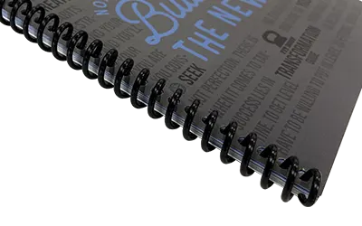
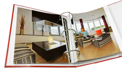
When selecting a cover option, we encourage you to consider adding special finishes to enhance the look and feel of your annual report. Among our most popular offerings for adding that extra-special touch, we have:
Lamination: Laminating the cover adds a protective layer that improves durability and provides a glossy, matte, or velvety “soft-touch” finish.
Varnishing: Varnish can be applied to the cover to add a subtle sheen and enhance colors, textures, and graphics.
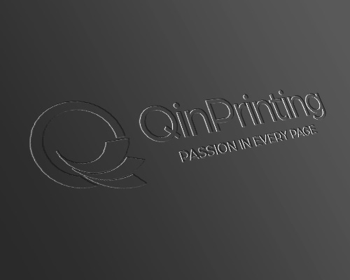
Embossing and debossing: These techniques create raised (embossed) or recessed (debossed) impressions on the cover, adding texture and visual interest. You can use them for logos, text and titles, and combine them with other finishing techniques such as foil stamping or metallic inks.
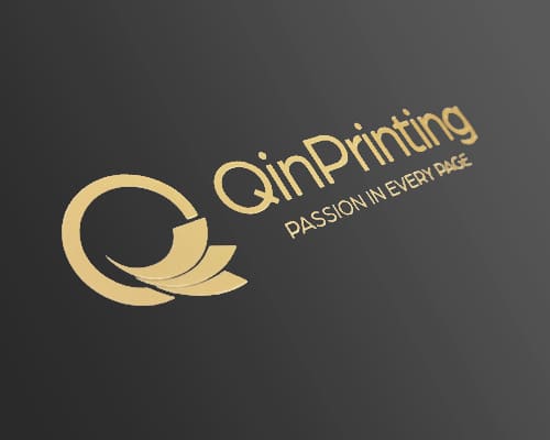
Foil stamping: Foil stamping involves applying metallic or colored foil to selected cover design elements such as the title and your company logo, creating a luxurious, classy, and eye-catching effect.
Vinyl covers: Vinyl covers offer durability and water resistance, making them suitable for reports that will be frequently handled or exposed to harsh environments.
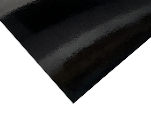
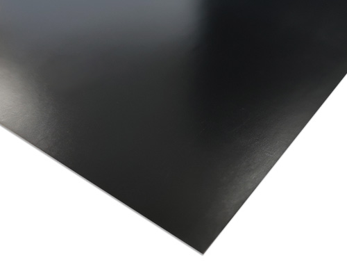
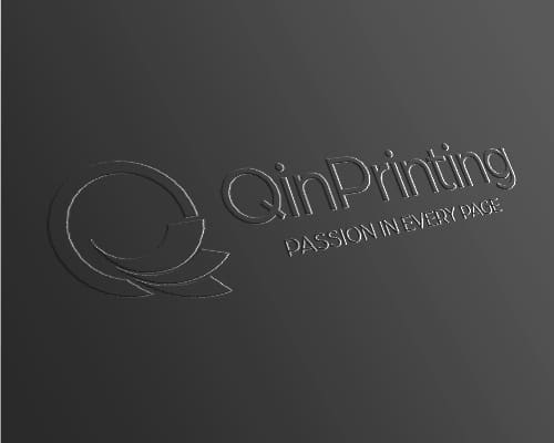
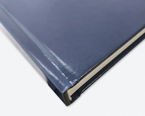
By selecting the right cover and binding options, as well as incorporating special finishes, you can create an annual report that not only looks professional but also withstands storage, distribution, and handling while keeping in pristine condition.
Talk to us!
In today's hyper-competitive and sensitive business landscape, a well-designed and professionally printed annual report is often essential for building trust, communicating your company's achievements, and attracting investors and stakeholders to your brand. At QinPrinting, we understand the importance of producing high-quality printed materials that reflect your brand's values and meet your specific requirements.
Whether you're looking for guidance on paper selection, design and layout assistance, or advice on cover options and finishes, our team of experts is here to help. Contact us today to discuss your annual report printing needs and discover how we can bring your vision to life.
Don't settle for ordinary — elevate your annual report with QinPrinting and make a lasting impression on your audience.

