We all know that brochures work, but in today's competitive marketing ecology, it's vital to innovate and find new ways to make your brochures better and work harder for your business
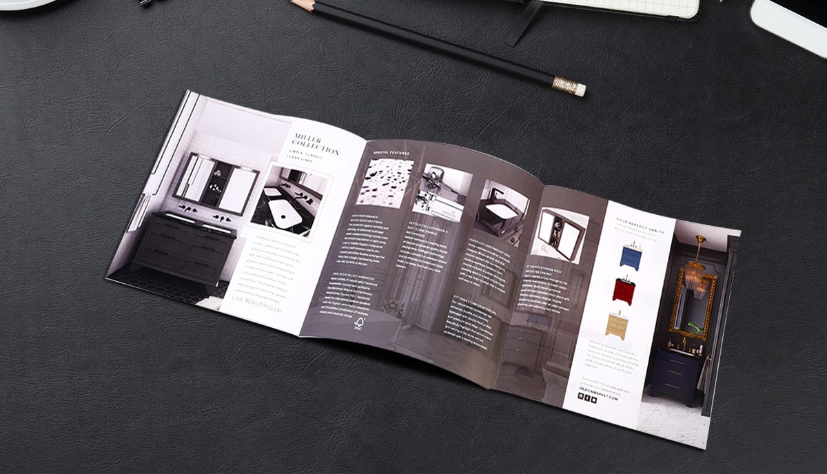
Brochures are one of the most popular and effective print marketing materials. They're versatile, attractive, cost-effective, and often… all look the same! So don't be lazy with your brochure design. Whatever your purpose in creating a brochure campaign — to raise brand awareness, to make direct sales, to promote a new product line, to drive foot traffic to your high street store, or anything else — use these 10 smart ways to make your brochures better and make sure that they capture the attention of your target audience.
1. Make your brochures inviting
Just stop a moment and take a look at your appointments diary. How many times a week or a month do you send out invitations, either to potential clients, colleagues, suppliers, or stakeholders? Each time you send out an invitation, why not make it a brochure? It'll be more interesting, more informative, and more likely to stick in the memory of the person you're inviting to a given event.
2. Use innovative folding designs
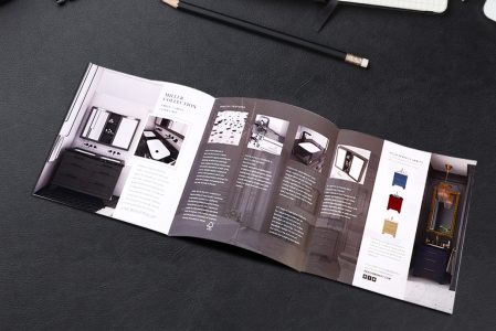
There are many ways to fold a brochure, and most of us are overfamiliar with the simple bi-fold, tri-fold, accordion fold, and other standard folding options. Go to town on your brochure design. Experiment with new folding options and techniques. Cross-folds, over-folds, collapsing-folds, and more are all worth experimenting with. You don't need a degree in origami, just a little creative imagination!
3. What shape are brochures?
You've probably answered that brochures are rectangular or square in shape. While that's usually true, there's no law that says they must be that way. Why not try circular, silhouetted, hexagonal, or other shaped brochures? There's no reason why not. When we make brochures we use the die-cutting machine in any case, so it's a great opportunity to innovate with new and exciting brochure shapes to make your marketing material more eye-catching but with very little extra cost.
4. What size is a brochure?
Most people answer that a brochure is standard letter size or perhaps A5 when folded. It's true that if you want to slot your brochures into standard display stands, you may need to stick to standard sizes. But otherwise, as with shape, there is no law obliging you to do so. We've made an extremely effective tiny brochure that was just a couple of inches square. It was an innovative idea, and it worked just great. What about going in the other direction and making a tabloid-sized brochure? We can customize your brochures to any size you choose. The only limit is your imagination.
5. Re-purpose your online graphics
Sometimes you just need to rethink the visual content of your brochures to make them stand out. A great way to do that at low cost is to re-purpose infographics and diagrams that you've already published online. Infographics are most often associated with blogs and websites but it's easy enough to convert them into PDFs ready for printing. And why not?
6. Make your brochures fun
Just as an origami artist can turn a flat sheet of paper into a swan, human figure, or a fortune-telling game, so you can get more creative with your brochure design. We've already looked at the possibilities of experimenting with innovative sizes, shapes, and folds. But you can use those elements in a dynamic design which goes beyond mere aesthetics to create an interactive experience which will be pleasurable and memorable for your audience. Take, for example, the classic folded fortune-telling game we just mentioned. Wouldn't that make an excellent brochure design? Get your team brainstorming and see what other ideas you can come up with!
7. Don't just illustrate, communicate
All too often the visual aspects of brochure design are used only to illustrate or decorate rather than communicate. But choose your images carefully — whether photos, cartoons, line drawings, graphics, or anything else — and make sure that they speak directly to your target audience about your brand, products, and services. Do you remember the photo stories published in teen journals? You could do a similar thing with your brochure advertising, including overlaid speech bubbles and commentary. Always be on the lookout for interesting new ways to use imagery in your brochures.
8. Be generous and give something away
It's no longer news that giving away free products, information, and experiences to potential customers is a great way to draw them into the sales funnel. But did you ever think of using your brochures as gifts? It's easily done. Think about the run-up to holiday sales, for example. Turn your brochure into an invitation to come in store and pick up a free Christmas gift. Most people will remember and respond to that invitation, and of course once they're in store, they are likely to make further purchases or at the very least be exposed to your products.
9. Use special printing techniques
We can do so much more for you than simply slap the ink on the paper! Consider deploying one or more special finishes on your brochures. For example, soft-touch lamination will give them a luxury velvety feel under your customers' fingertips. Varnishing or gloss lamination will make them bright and shiny to really catch attention. Embossing your company name or logo literally makes it stand out. And what about foil stamping in gold, silver, or bronze for a superlative and eye-catching effect? Die-cutting a window or special shape into your brochure panels can add style and intrigue which always draws attention. Talk to us about the possibilities and we will be happy to advise you.
10. Make your brochures useful and interactive
While this won't be appropriate for all brochures, there are many ways that you can add value to them by making them useful and interactive. For example, if you are producing a brochure to advertise a medical clinic, you can add a panel which gives emergency numbers, surgery hours, and other useful information. This means your brochure is more likely to be kept, stuck to the fridge with a magnet, or pinned to a notice board, where it will be seen multiple times over the course of many months or even years. Or you can leave space for wish lists and notes. And while you're at it, why not include a pencil or mini-pen with your brochure, too?
Talk to us!
Over the last 25 years and more, QinPrinting has built a global reputation for excellence as one of the most trustworthy and high-quality enterprise-level offset printers in the world. We help design and print thousands of superb brochures for our business clients every day. We'd be delighted to put our years of experience, our accumulated expertise, our state-of-the-art technology, and our passion for print and people at your disposal.
When you're ready to create your next innovative brochure marketing campaign, talk to us first. You can easily get in touch by telephone, email, Skype, the online chat, or our handy contact form. An expert member of our printing staff will be delighted to answer your questions and guide you through the process. We can't wait to work with you and play our part in making your next campaign the most successful yet!

