Whether for reasons of economy or creative control, many self-published authors prefer to handle their own interior book design. Here, we share the fundamental tips you need to get it right.
Interior book design plays an essential role in creating visually attractive and reader-friendly book layouts. It involves the art of arranging text and images in a way that is logical, aesthetically pleasing, accords with the overall book design, and provides an optimal reading experience. If your budget allows, it's probably best to employ the services of an experienced book designer to do all this for you. But if you opt to take the do-it-yourself approach, we're here to help.
While the process may seem daunting, understanding the fundamentals of interior book design, formatting, and layout can help you create beautiful book interiors that will translate seamlessly to print and give your readers the best possible experience with your book. So, without further ado, let's dive in.
Book formatting vs. book layout
Before getting into the technical details of interior book design, it's important for you to understand the difference between book formatting and book layout. They are often confused and thought to be the same thing. Although both terms refer to the arrangement of elements — text, images, graphics, dividers, numeration, footers and headers — within a book, they have unique aspects from both technical and artistic perspectives.
Strictly speaking, book formatting is the more technical aspect of interior book design. It is about making sure that the main content of the book is well-balanced on the “book block” — the area of the page on which the principal text will be printed. This includes, for example, decisions about font selection, type size, kerning, leading, tracking, and white space to create a cohesive, functional, and visually pleasing layout.
Book layout is more artistic in scope and deals with the way the formatting is incorporated into the overall interior book design such as setting margins, harmonizing the balance of images and text blocks, and maintaining consistency and narrative flow throughout the design.
Choose the trim size
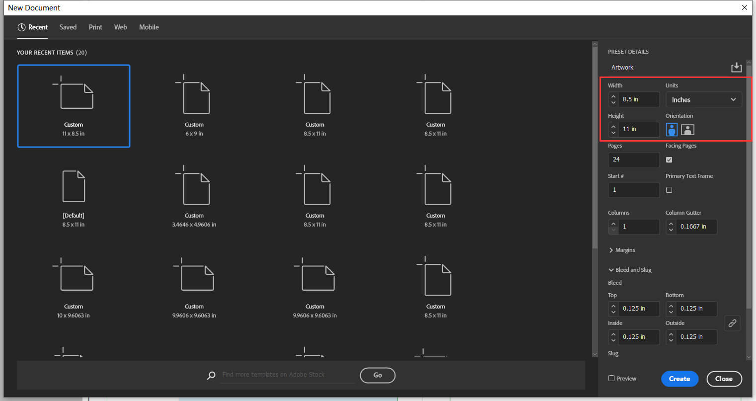
One of the first steps in interior book design is to choose the trim size of your book. The trim size refers to the height and width of the book once it has been completed and the pages cut. So, it's vital to allow an excess in your design, marked clearly by “trim lines” to show the printer where the actual edges of the finished book should be and make sure that all the important text and graphical elements are safely within that outline.
To see what this looks like, you can download one of our free book design templates.
Get the margins right
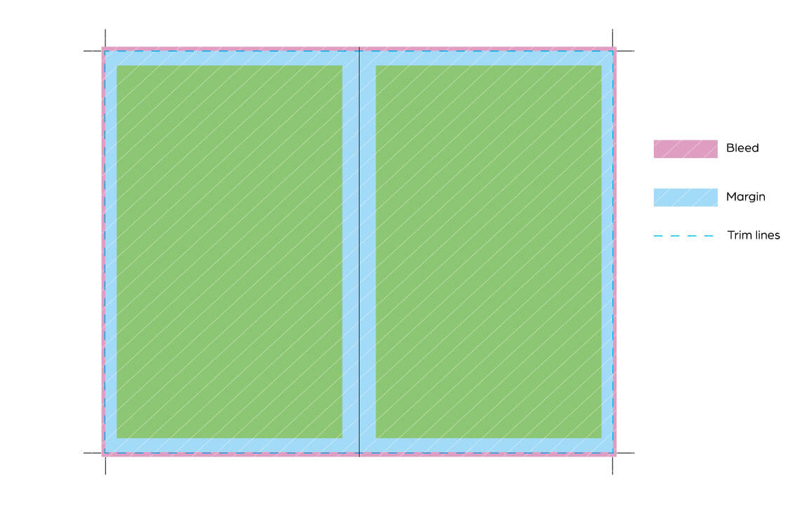
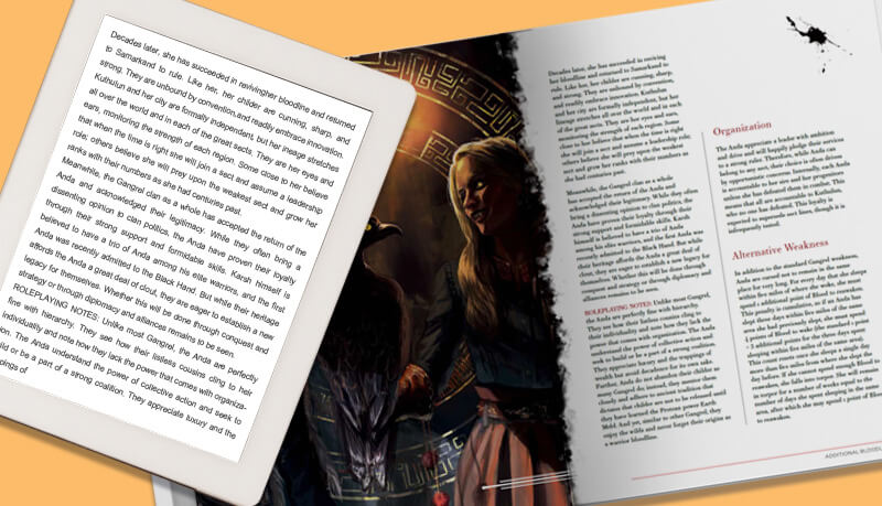
Margins play a crucial role in interior book design as they provide the white space needed to improve text readability and avoid content being cut off if it is too close to the edge of the book.
There are four main margins to consider: top, bottom, outside, and gutter. Let's examine each.
- The top margin is where you typically include information, such as the author's name and the book or chapter title.
- The bottom margin is home to the page number and may also provide additional white space.
- The outside margin allows readers to hold the book without covering parts of the text.
- The gutter is the inside margin where two pages meet, making sure that the text on mirrored pages doesn't overlap.
To help guarantee a visually pleasing layout, it's important to maintain consistent margin sizes throughout the book. Typically, outside, top and bottom margins are set at around 0.5" / 12.7 mm, while the gutter margin is slightly larger, around 0.75" / 19.5 mm. It depends on the size of your book, but at least 0.125"/ 3 mm. By setting appropriate margins, you prevent text from feeling cramped and allow readers to read all the words in the printed book comfortably. This, obviously, is vitally important!
Interior bleed
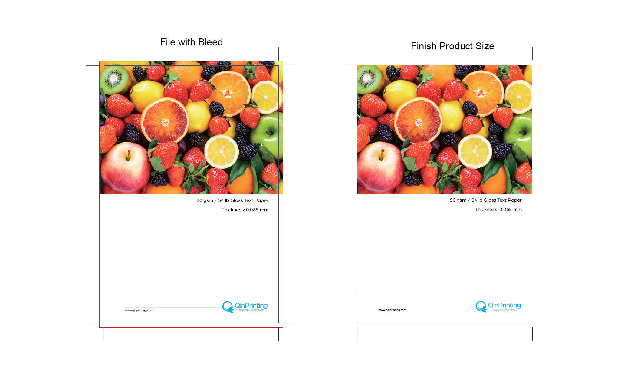
No, it's not something horrific or medical! Interior “bleed” is a technical term in book design and printing, which refers to an added portion at the page perimeter which gets cut off when the pages are trimmed. But it's different to the trim line as it shows the designer the full extent to which any images or artwork should “bleed” out if you want them to fill the entire finished page with no white lines around the edges.
A typical bleed is 0.125" / 3 mm all round each page aside from the gutters. And don't forget to “mirror” your trims and bleeds, as the outer edge will alternate between left and right.
Select a good font
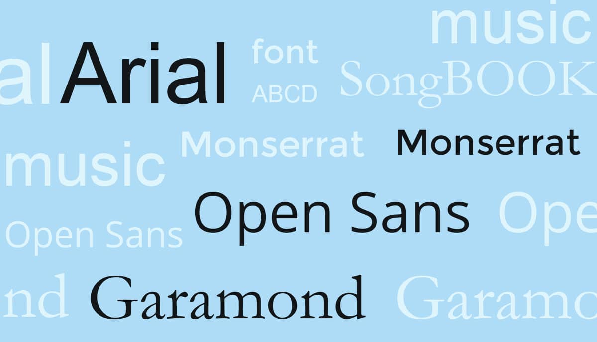
Choosing the right font is fundamental for a well-designed book interior. The primary purpose of any font is to render the text attractive and easily readable. So, it's essential to select typefaces or fonts that are easy-on-the-eye, clear on the page, and can be read and understood without difficulty. While there are countless font options available, it's best to stick with traditional and widely recognized fonts such as Times New Roman, Garamond, or Bookman for most books.
Whimsical, elaborate, or decorative fonts like Rustal Typo or Medusa Gothic are better suited for art books or children's books, where the font choice can contribute to the overall visual theme and artistic effect — and where there's less text altogether that needs to be read. Remember to consider the genre and tone of your book when selecting a font. A font that matches the content and style of your book will enhance the reading experience and maintain a cohesive design. To get more detailed expert advice on font options and best practices, check out our post, How to Choose a Font.
Consistency across design
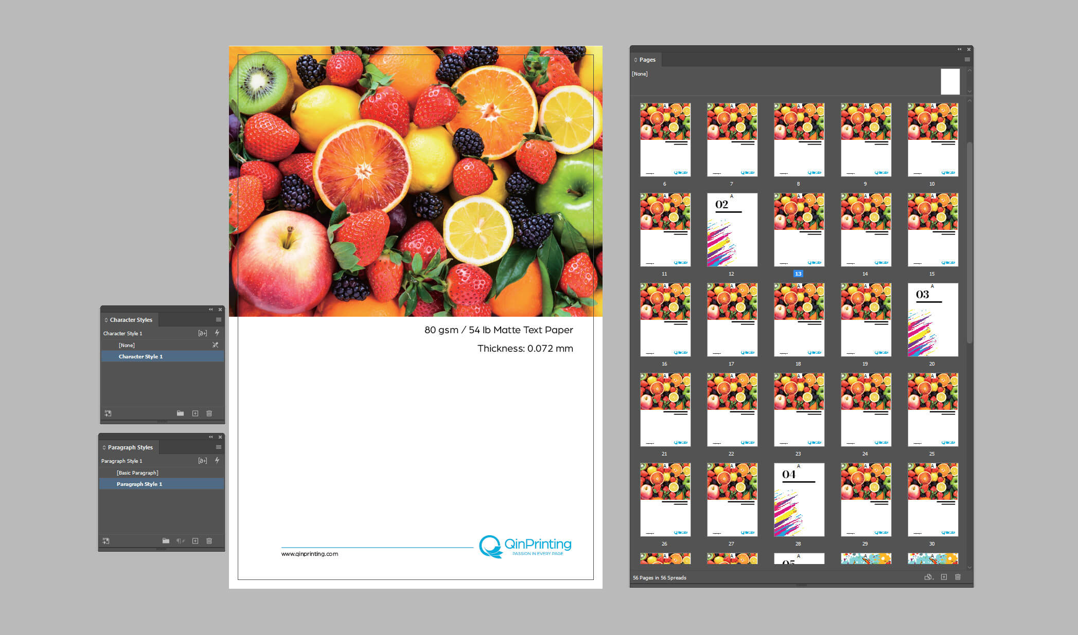
Consistency is a vital aspect of interior book design. By maintaining a consistent design throughout the book, you create a cohesive reading experience and avoid distracting the reader with abrupt changes. Here are some key design elements to establish and maintain consistency:
- Chapter headers: Choose a single style for chapter headers, including the font, size, and positioning, and stick to it. This helps readers easily navigate through the book and provides visual cues for chapter breaks.
- Paragraph styles: Set up clear paragraph styles, such as indentation, line spacing, and alignment. This gives a uniform and professional look throughout the entire book.
- Running heads and end-of-chapter elements: Create running heads (headers that appear at the top of each page) and end-of-chapter elements, such as footnotes or acknowledgments in the same formats. These elements should follow a predefined style and positioning.
By adhering to a consistent design, you help your readers focus on the content without being distracted by inconsistencies or sudden changes in formatting and appearance.
Creative ideas for chapter openings, quotes, and pictures
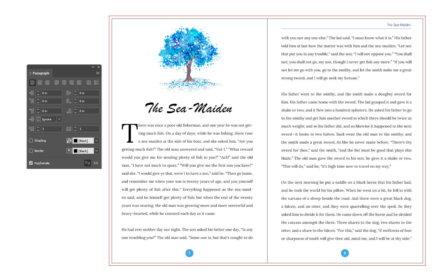
Chapter openings and introductory sections offer an opportunity to add a little of class and creativity to your book's interior design. These pages set the tone for each chapter and while you don't want to go over the top, a little flourish can make a more beautiful book. Think about the following design ideas:
- Drop capitals and alternate fonts: Using drop capitals or a different font for the first letter of each chapter can create visual interest and elegance and artistry to your design without distracting the reader from the main content.
- Quotes or illustrations: Incorporate quotes from fictional characters or real-life personalities to set the tone or theme of each chapter. Adding illustrations or graphics can enhance the visual appeal of a new section or divide one chapter or part from another.
- Unique formatting: While consistency within elements is important, you can differentiate introductory pages from the rest of the book by using smaller font sizes, italicizing or underlining text, and centering the content on the page. This creates a distinct visual presentation and enhances the overall design.
By applying creative design elements to chapter pages and introductory sections, you create a visually engaging experience that captivates readers and adds depth to your book's interior.
Don't forget special pages
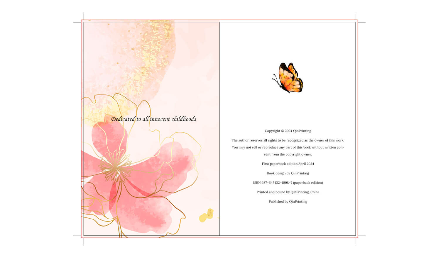
Specialized pages, such as your copyright page, preface, acknowledgments, indices, and afterword, require unique formatting that sets them apart from the rest of the book. We've already mentioned the idea of using smaller font sizes, italicized or underlined text, and centered alignment for these pages. But you could also consider special page numbering, such as Roman numerals for the foreword, to help distinguish these sections further. By employing different formatting techniques and styles for specialized pages, you create a visual hierarchy that helps readers navigate and understand the various components of your book.
For more in-depth advice about how to design your all-important copyright page, what to include in it, and how to handle the layout, read, How to Create a Copyright Page.
Choose the right paper
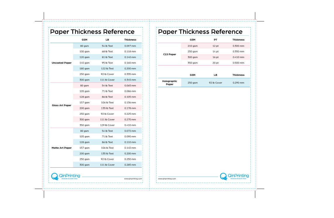
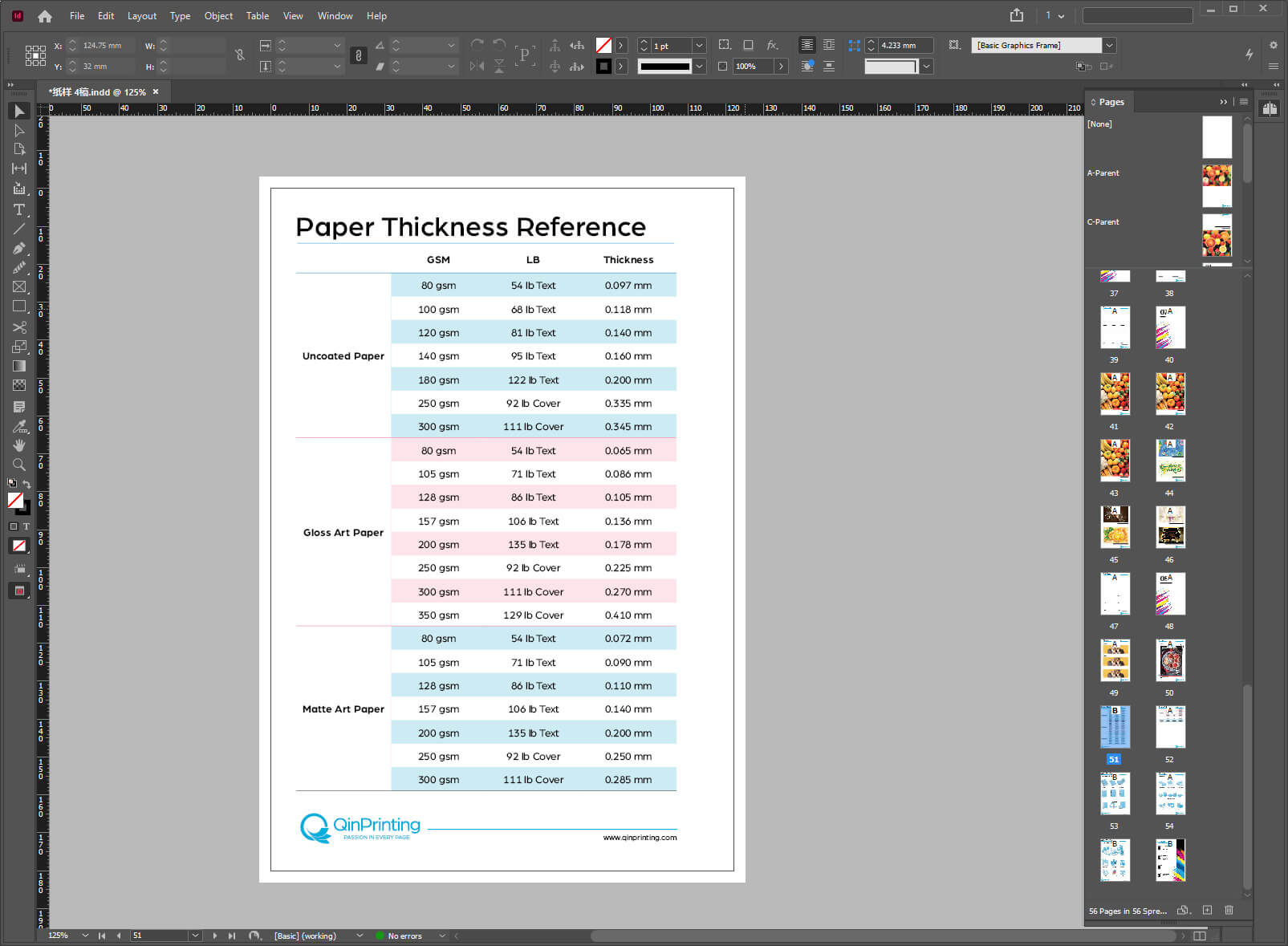
Often overlooked, the choice of paper is in fact part of your interior book design choices and a very important one. The weight, texture, and color of the paper on which you'll print your book's interior has a significant impact on the fonts, layout, trim size, and more — not to mention the reading experience. Opting for high-quality paper makes sure that your book feels substantial and durable. When readers hold a well-crafted book with pages that are resistant to tearing and fading, it increases their overall satisfaction and perception of the book's value.
Consider the intended use and longevity of your book when selecting paper. If you expect readers to keep your book on their shelves for years or decades, investing in high-quality paper will ensure its longevity and durability. To get a deeper dive into this essential topic, read, How to Choose the Right Paper.
Calling in the professionals
Even if you've decided — for whatever reason — to eschew the help of a professional third-party book designer, collaborating with other professionals is an integral part of the book-writing and book design process. Hiring editors and proofreaders helps make sure that your words are impactful, grammatically correct, and free of typos and that your interior book design is attractive, clear, and easy to read. These professionals play a vital role in enhancing the overall quality of your book's content.
Similarly, if you can afford it, working with experienced book interior designers is an excellent option. These designers have the expertise to choose the optimal presentation format for your book, select appropriate fonts, and develop a cohesive and visually appealing layout. And if you're worried about creative control, you needn't, as independent designers of quality will understand that the author always has the final veto over any decisions they suggest.
Before embarking on printing your book, we strongly suggest partnering with professionals who understand the nuances of book design and can help you create a book that is not only well written but also looks great.
Choose a printer that understands design
When you're ready to transform your book into a physical printed edition, don't just go with any old printer or assume that the printer on your doorstep will always do. To get the best for your book — and your budget — you'll need an offset printer with an expert staff who understands the intricacies of book design and professional book design software such as InDesign and Illustrator.
Interior book design is a super-important aspect of creating not only a reader-friendly book but one that's likely to sell. By implementing the tips and strategies we've looked at in this post, you can enhance the readability and appeal of your book's interior. Designing a book's interior might not seem like as much fun as choosing a book cover design, but in every profession, there are little details that reveal the time, attention, and care you've put into your work. For independent authors and small presses, paying attention to these details can make a favorable impression on potential customers, especially those inside the trade — booksellers, librarians, and others who are intimately familiar with book publishing standards.
Talk to us!
At QinPrinting, we've been in the offset printing industry for almost 30 years now, and have helped innumerable authors achieve success with their self-published books. Our expert book design and printing team, together with our state-of-the-art offset printing technology, and a sincere effort to give world-class customer care sustains our global reputation for combining the speed, efficiency, and value for money you expect from a major international printer with the personal attention you'd want in your local print shop. Get in touch today to discuss your needs or ask us for a no-obligation quote. We're here and happy to help.

