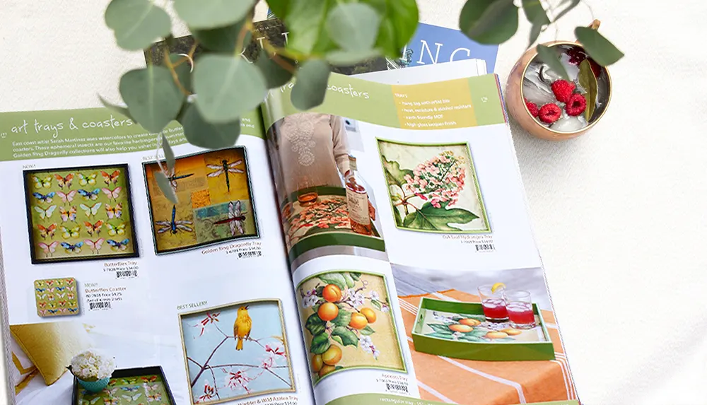
Printed catalogs are powerful — and popular — marketing tools. Use these powerful design ideas to make yours stand out from the crowd

Despite the advent of the digital age and the spread of e-commerce, printed catalogs are still one of the most powerful marketing tools in your arsenal. Even global tech retail giants like Amazon use them. So, if you don't yet have a printed product catalog in your mix, or you do but it's not getting the results you'd like to see, we can help you design a catalog that delivers. The following six design ideas will give your catalog the edge, helping you to build your brand, increase customer engagement, and boost sales.
Why do printed product catalogs still work?
According to research, printed catalogs still work because people of all ages love them! They're enjoyable to browse through, relaxing, and inspiring. Most consumers say they refer to printed catalogs before buying goods, even if they make the purchase online. Consumers are increasingly wary of online scams and suffer from ‘ad blindness' or use ad blockers when they're surfing the Internet, these days. It's an effect known as ‘digital fatigue'. Whereas printed marketing materials — catalogs very much included — are perceived as more reliable, authoritative, and trustworthy. So, let's dive into six great ideas to make yours the best.
Clarity and simplicity in design
The best catalogs are a pleasure to read and browse. They should be easy on the eye and straightforward to navigate and understand. This means taking clarity and simplicity into account as you organize your content and layout the interior of your printed product catalog.
For example, don't overcrowd each page with products. One or two, beautifully photographed and presented, with minimal text and plenty of white space is more appealing. And the more appealing the page layout and the visual experience your customer enjoys, the more likely they are to linger and absorb the marketing messages.
You don't need to put all the technical details in your catalog. If a consumer is interested, you can add a QR code which they can scan with their smartphone to check out further information online. Keep the pages of the catalog itself streamlined and elegant for the best effect.
Add surprising details and gifts
It's incredibly easy, with a little thought, and even less added expense, to add details and surprises into your printed catalog that will make the experience of reading it more pleasurable for the consumer and more memorable, too. Just as a few possible examples — and the bright sparks in your marketing department should be able to come up with many more — think about the following:
- Add a flap, folder, or envelope inside the cover and drop a thank you note and a discount card inside
- Include a pull-out guide or recipe booklet, or another useful gift depending on your products
- If your catalog is family oriented or aimed at kids' products, include coloring pages, quizzes, and cartoons
Those are just a few ideas to get you thinking along the right lines. The key is to make the experience of browsing your catalog more personal, unique, and memorable. Simple ideas like this built into the design can add a lot of value and build trust, too.
Don't be a square!
Your catalog doesn't need to have square or rectangular pages. To make it more eye-catching and innovative, why not produce a printed product catalog which is triangular, round, or oval? A good custom printer — hello, that's us! — should have no difficulty in accommodating such unusual designs.
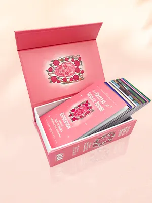
But if you want to keep the traditional portrait or landscape-oriented rectangle, you can still get creative in other ways. How about an intriguing window-cut cover? Or foldout spreads? Maybe include shapes in the form of branded cardboard coasters or even an origami page.
Why not? It's your catalog and it's a competitive market, so any small innovation which makes your catalog more exciting than the next is worth trying. Don't be ‘a square'. Give your imagination room to play and delight your customers in unexpected ways.
Materials and messaging
The materials your catalog is made from are more than just a substrate for the application of ink. They can play a powerful role in your messaging. So, choose your materials wisely to reflect your brand.
For example, choosing high-quality paper stock with a gloss or silk coating can indicate luxury and indulgence, as could an embossed cover with gold foil stamping. Likewise, you can tout your environmental credentials with earthy, natural-fiber, recycled paper. In fact, at QinPrinting, all our papers — even our luxury stock — are either recycled or from sustainable FSC-certified forests and we use exclusively environmentally-friendly vegetable-based inks.
But the point is, your choice of paper, coatings, and bindings can all do more than fulfill their practical functions. They can speak. They can communicate and reinforce your brand identity and marketing messages in unique and potent ways.
A picture speaks a thousand words
Did you ever come across the most recent Bonobos catalogs? They don't have any words. Pure, stunning visuals, and nothing else. And they're a huge success.
Now you don't need to go that far. But it does make the point that an image can do far more heavy lifting in marketing terms than a bunch of clever words. So, make sure that your photography, graphics, and other visual messaging are as high-quality and beautiful as you can afford.
Also think about how you present your products. Let's say you're an MTB (mountain bike) retailer. Which is more likely to sell your product: a straight-on, plain background product photo, or an action-shot of a smiling, beautiful couple kicking up dirt on a mountain trail? Yup. Context is everything in contemporary product catalog presentation. It's powerful stuff. Use it.
Fancy features
Often, just one or two tiny changes or additions to your printed product catalog can make all the difference. For example, going for a cover which has gold or silver foil stamping, an embossed or debossed title, or UV spot coating can give it that extra-special look which makes it really ‘pop' and draw the eye.
And while these features are fancy and effective, they're not significantly more expensive if you factor them into your design budget. You could also think about using die-cutting and other texturing techniques. These can be great ways to spruce up an existing catalog on a shoestring, because you need only alter the cover file on your next print run.
Creating the Perfect Catalog
So, there you have it. The printed product catalog remains an important marketing and sales tool. But it's vital that you do everything you can to make yours stand out and work as hard as possible for your business. Done well, a good catalog can offer a fantastic return on investment.
With these top catalog tips, you can destine your catalog for success from the design stage or use them to tweak and improve on your existing design and layout. But as a catalog may represent a significant — although worthwhile — investment, it's worth paying attention to the details and trying a few innovations, to cut above the rest and maximize your returns.
Ready to create a stunning product catalog?
Talk to us. At QinPrinting, we have over 25 years' experience working with businesses just like yours, to guide you through every stage of developing your perfect catalog design. As printers, we have a deep well of knowledge and expertise from which to draw, put the latest digital and offset technology at your disposal, and pride ourselves on a sincere commitment to customer care and satisfaction every step of the way. Get in touch today and one of our friendly, expert team will be delighted to chat through your ideas or give you a no-obligation quote. We can't wait to work with you!


