Color has powerful psychological and emotional connotations and the choice of colors you make for your book design can make a surprising difference to the effect your cover will have on potential readers. Here, we explore the emotional impact of color in book design and offer helpful tips for how to choose the right color combinations for your book
For designing a book cover, one of the most important decisions you'll make is choosing the right color or color combinations. Color plays a significant role in capturing the attention of potential readers and conveying the mood and genre of your book. But with so many colors to choose from, how do you know which one is the most attractive for your book cover or which colors will complement each other? In this post, we'll be looking at the art of choosing the perfect color scheme for your book cover, delving into color psychology and the impact of different colors on reader perception.
Understanding the power of color in book covers
Before we dive into the various colors and their effects, let's take a moment to understand the power of color in book covers. Colors can evoke emotions, create associations, and communicate messages. They can elicit feelings of excitement, tranquility, mystery, or passion. By strategically selecting the right colors for your book cover, you can attract your target audience and make a strong visual impact. So, as you'll have grasped, there's no single, one-size-fits-all answer to the question of what is the most attractive color for a book? It all depends on what the book is about, who it's for, and what you want the cover to say about the content. The real question is what is the most attractive color scheme for your specific book. The rest of this post should give you enough information to help you figure that out.
The psychology of color in book cover design
Color psychology is the study of how colors influence human behavior, emotions, and perceptions. Different colors have distinct psychological effects, and understanding these effects can help you make informed decisions about your book cover design. Let's explore the psychology behind some of the most commonly used colors in book covers.
Blue
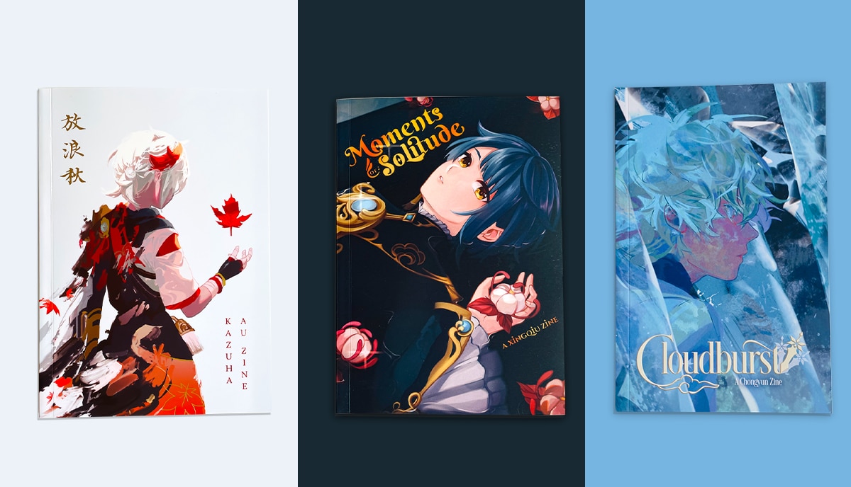
Blue is a versatile color that is often associated with calmness, trust, and reliability. It evokes a sense of tranquility and is commonly used in book covers for genres such as self-help, spirituality, and mystery. Blue can create a sense of depth and introspection, making it an attractive choice for books that delve into complex psychological themes or inner journeys.

Red
Red is a bold and attention-grabbing color that is often associated with passion, energy, and excitement. People use red in book covers for genres such as romance, thrillers, and action-packed novels because it evokes powerful emotions. Red can create a sense of urgency and intensity, instantly capturing the reader's attention and conveying the thrilling nature of the story within.

Green
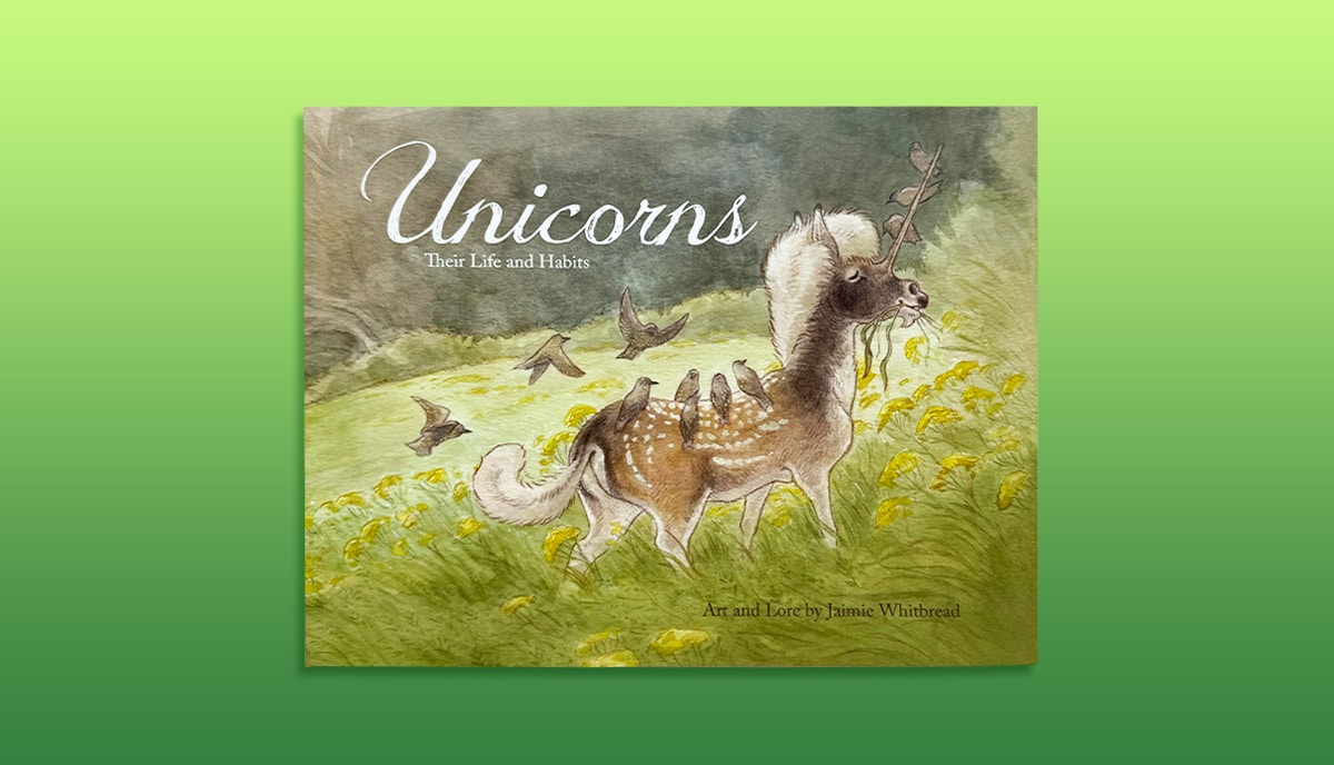
Green is a color that symbolizes growth, harmony, and nature. Books about health, the environment, and self-improvement frequently fall into this category. Books that advocate for wellness and sustainability can benefit from the color green because it can evoke feelings of regeneration and harmony.
Yellow
Yellow is a vibrant and cheerful color that is often associated with happiness, optimism, and creativity. It evokes feelings of joy and appears frequently on book covers for genres like children's books, self-help, and inspirational stories. Yellow can create a sense of positivity and playfulness, instantly drawing the reader's attention and inviting them into a world of imagination.

Purple
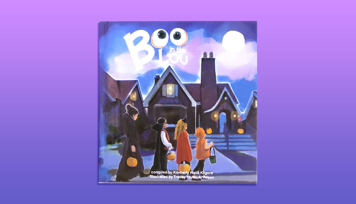
Purple is a color that is often associated with royalty, mystery, and spirituality. Book cover designers often use purple to convey a sense of luxury and mystery, especially for genres like fantasy, paranormal, and historical fiction. Purple can create an aura of enchantment and intrigue, capturing the reader's imagination and setting the tone for a captivating story.
White
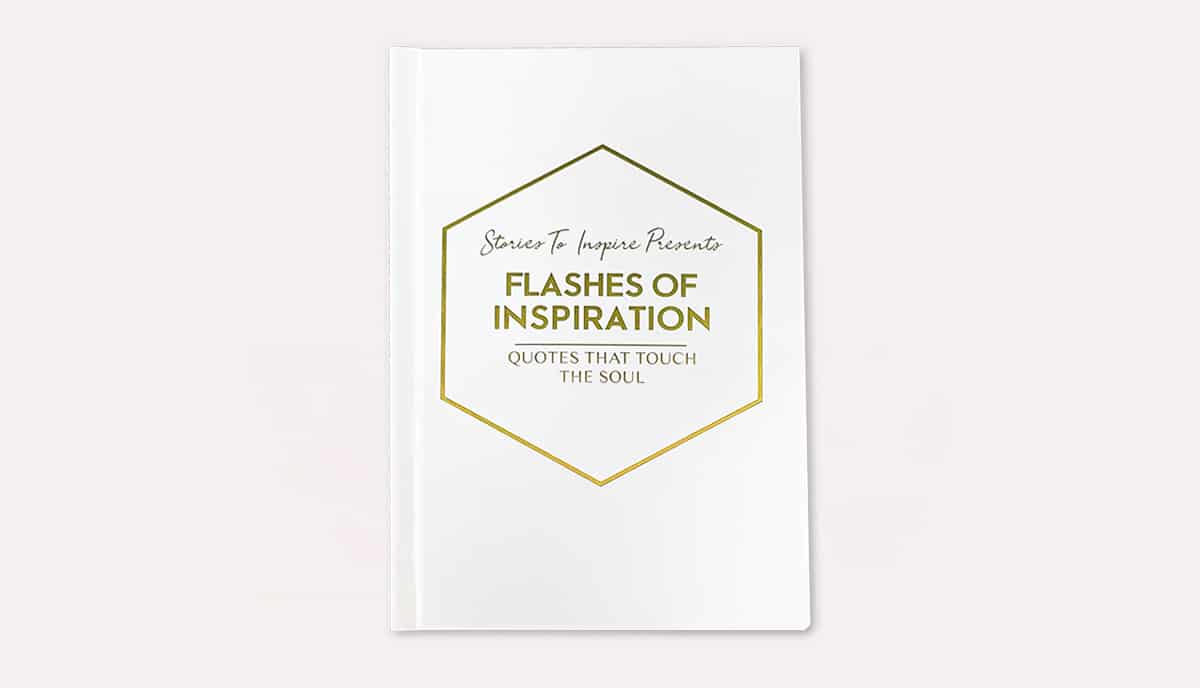
White is a color that symbolizes purity, simplicity, and clarity. We widely correlated it with literature about spirituality, self-improvement, and mindfulness. Books that aim to impart wisdom and develop inner peace may benefit from using white as the primary color because it evokes feelings of calm and serenity in the reader.
Black
Black is a color that conveys authority, power, and elegance. We frequently connected it with works of fiction belonging to the mystery, suspense, and crime genres. Using black can evoke feelings of mystique and refinement, at once seizing the attention of the reader and indicating a story that is both interesting and exciting.

Choosing the perfect colors for your book cover
The above list is far from exhaustive, but as there are entire books written about color psychology, we can't explain all the details in the space of a blog post. However, these are the most common colors used in book covers, along with their most powerful associations. We always recommend that you research the bestselling book covers in your chosen genre and analyze what's working. Of course, there will always be exceptions to every rule, so you'll need to trust your gut as much as the data. Bearing that in mind, here are some tips to help you make the right decision about the best colors to use for your book cover.
• Genre
Different genres have different color associations, and it's important to align your book cover color with the expectations of your target readership. Research successful book covers in your genre and note the color palettes that are commonly used. While it's important to stand out, it's also essential to convey the right genre signals through color. You'll often find that there's a key color that dominates the overall impression and then so-called “accent colors” which are often complementary colors on the color wheel.
• Mood
Think about the mood and tone of your book's content. Color is a powerful stimulant of specific mood types, so you must get this right! Is it lighthearted and whimsical, or dark and mysterious? The color of your book cover should reflect the overall mood of your story or subject. For example, if your book is a light-hearted romance, you might use soft pastel pinks and violets to convey a sense of warmth and tenderness. For a thriller, you could use reds to give a sense of danger and black or dark green for contrast.
• Readership
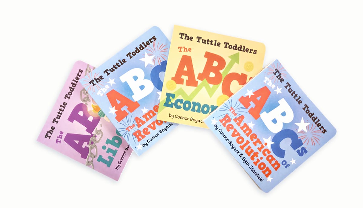
Consider the preferences and expectations of your target readers. What colors are they drawn to? What emotions do you want to evoke in them? By understanding your audience, you can select a color that resonates with them and captures their attention.
• Color combinations
Don't be afraid to experiment with different color combinations. Create mock-ups of your book cover using various colors and see how they look. Gather feedback from friends, colleagues, or even potential readers, say, via your social media, such as Instagram, Facebook, and TikTok, to get a better understanding of which colors are the most appealing and effective.
Choosing the right color palette for your book genre
When selecting a color palette for your book cover, it is important to consider the genre and target audience of your book. Different genres have different color associations, and using the right colors can help convey the genre of the book at a glance. Here are some common color palettes for different book genres:
• Mystery: black, gray, and dark colors
Mystery novels often have covers that feature black, gray, or other dark colors. These colors create a sense of suspense and intrigue, setting the tone for the mysterious and thrilling story within.
• Romance: pink, red, and soft colors
Romance novels often feature covers that use pink, red, or other soft and romantic colors. These colors evoke feelings of love, passion, and tenderness, appealing to the target audience of romance readers.
• Fantasy: purple, blue, and magical colors
Fantasy novels often have covers that feature purple, blue, or other magical and mystical colors. These colors create a sense of wonder and imagination, hinting at the fantastical worlds and creatures within the pages.
• Science fiction: blue, silver, and futuristic colors
Science fiction novels often feature covers that use blue, silver, or other futuristic colors. These colors convey a sense of technological advancement and otherworldly settings, capturing the essence of the sci-fi genre.
• Thriller: red, black, and intense colors
Thriller novels often have covers that use red, black, or other intense and dramatic colors. These colors create a sense of suspense and danger, setting the tone for the thrilling and action-packed story.
• Non-fiction: blue, Green, and professional colors
Non-fiction books often feature covers that use blue, green, or other professional and authoritative colors. These colors convey a sense of trustworthiness and expertise, appealing to readers seeking knowledge and information.
While these color palettes are commonly associated with specific genres, it is important to remember that there are no hard and fast rules. Ultimately, the color palette should work with your specific book.
Incorporating Color in Book Cover Design
Once you have selected a color palette for your book cover, typically only two or three colors are best, it is essential to incorporate the colors effectively in the design. Here are some tips on how to do it:
• Background
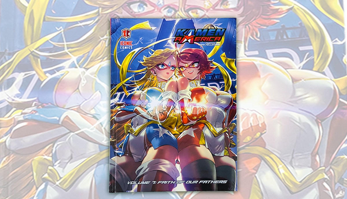
The background color sets the overall tone and mood of the book cover. This is your “key color”. Consider using gradients or textures to add depth and visual interest to the background.
• Typography
The color of the typography should be legible and contrast well with the background color. Choose a color that enhances the overall design and makes the title and author name stand out. You might also consider embossing the title or author name, or both, and adding metallic foil stamping for an extra special touch.
• Focal image
If your book cover includes a focal image, ensure that it stands out from the background color. Use contrasting and complementary colors to create visual impact and draw the reader's attention to the focal point.
• Accents and details
Use colors from the palette as accents or details to add visual interest and create a cohesive design. You can use these for borders, icons, or other design elements that enhance the overall composition of the cover. Remember to maintain a balance between using colors effectively and avoiding overcrowding the design. A cluttered or busy design can be overwhelming and distract from the clarity of what you want your book cover to “say”.
Choosing the perfect color scheme for your book cover is an art that requires careful consideration of color psychology, genre expectations, and target audience preferences. By understanding the psychological effects of different colors and matching them with the mood and genre of your book, you can create a visually captivating cover that entices readers and communicates the fundamental emotional experience that your story will give the reader. Remember, the right colors can make all the difference in attracting readers and making your book stand out on the shelves. So, take the time to explore the world of colors and find the combination that brings your book cover to life.
Talk to us!
At QinPrinting, we have almost 30 years of success in the offset printing industry and helped thousands of self-published writers and independent creatives to create beautiful and successful print editions of their books in both paperback and hardcover. We have a huge amount of experience and expertise to put at your disposal. And we've made it super-easy to get in touch with us, either by telephone, email, the live chat, Skype, or the online contact form. We look forward to working with you on your book.








Hello, please advise, is using a black cover for a non-fiction book against the industry standards? I need a book cover for a woman's leadership book depicting them rising within the organization. Someone suggested a black cover with a two-tone hot air balloon. They suggested using one of the colors in the balloon for my name or sub-title. What are your thoughts? Should I stay with a blue or green book cover?
Hi, Jackie! This sounds like an interesting and important project. There isn't a hard-and-fast rule about using a black cover for a non-fiction book, including one on women's leadership. It's more about how well the cover design communicates the content and how it "speaks" to your intended readership. Although solid black color is usually more associated with death, darkness, and very bleak politcal issues, perhaps. You may be better going with the blue/green option. Our best advice would be, first to look at the color schemes that the bestselling books most like yours have. While standing out from the crowd can work, also following the core conventions can be a better idea. Make up a list of, say, half a dozen covers you like and then get in touch with a professional cover designer. Otherwise, if you're working on the design yourself, create several versions and ask for feedback among your friends, independent booksellers, and on your social media. These are tough choices and there's no one-size-fits all solution. We hope that helps and if you'd like one of our experts to contact you, let us know and we'll ask one of the team to shoot you an email.