We take a fresh look at branding and explain why it's rarely enough to have a logo. Do you understand the five levels of brand design? Don't worry, we explain it all here.
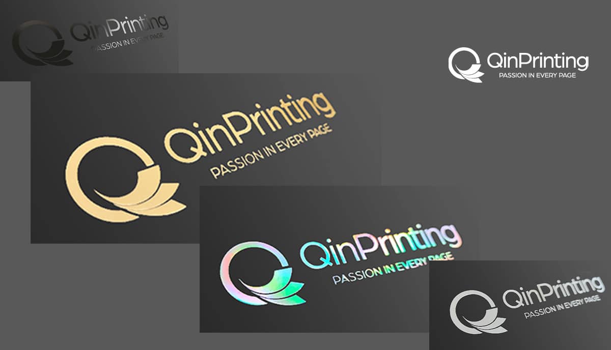
Whether you’re a professional graphic designer, a small business owner looking to up their game, or an independent creative with an urge for something extra-special in how you brand your business, we have several great ideas for up-scaling the branding of your product packaging. Let’s look at how to make it really stand out, attract attention, and stick in your customers’ and potential customers’ memories.
Beyond the logo
At QinPrinting, we’ve been in the offset printing business for over 25 years and in that time, we’ve established a global reputation for the quality of our products and our unparalleled customer service. We work daily with businesses large and small, independent creatives and entrepreneurs, retailers, publishers, non-profits, and more to print and manufacture superb branded packaging. Sometimes, simple is the answer; so, maybe a plain kraft box with a monochrome logo printed on the lid. But often, there’s much more you can do. If you’re stuck in a branding rut, it may be time to push beyond the logo. Let’s explore the five levels of branded design.
1. Color
Color is one of the most powerful aspects of any branding campaign. Colors speak volumes about your business, your ethos, your products, and your consumers. They work at a visual level (to catch the eye); at a psycho-emotive level (to engage the feelings); and at a neurological level (by encoding awareness and locking into the memory). It’s powerful stuff.
So don’t just go with a color for your brand based on your first idea of what “looks nice”. Dive a little deeper into it. Experiment with complementary and contrasting color schemes. Play around with overlaps and transparency. Read around the psychology of color to help you choose a winning combination that touches an emotional chord with your target market.
2. Typography
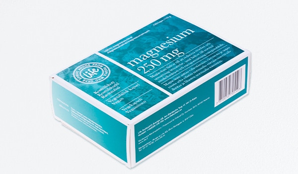
While it’s true that some brands go for a minimalist look, or have already gained such global brand recognition that they don’t need to print their business name, for most businesses, choosing a typeface or font that’s attractive, fits your brand, appeals to the market, and is easy to read and instantly recognizable, is worth the time you spend on it.
As with color, different lettering styles — from the standards such as Times New Roman, Arial, and Courier to less well-known and less frequently used fonts such as Empire State NF, Chickweed, and Labyrinth — have a strong and subtle psychological and emotional impact. Often, if your budget or your skills allow, we’d recommend that you design a custom font for your brand name. Unless you have good reason, avoid using those fonts that everyone’s seen a zillion times before, and pay for a licence to use a more interesting and less obvious choice if you can’t design your own from scratch.
3. Images
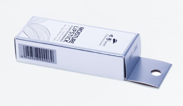
Graphic images — often the central motif of a brand logo — may be super-simple (like the Nike “swoosh”) or more complex (like the Starbucks “Melusine” or “Siren” image). But the image shouldn’t be an “off the shelf” clip-art graphic or stock symbol — again, unless you have a fantastic conceptual reason to go that route. Unless you have the knowledge, skills, and experience — not to mention the latest graphic design software — we recommend outsourcing this vital aspect of branding to a qualified third-party professional.
And don’t just say yes to the first iteration of any design. Always produce several versions, alternatives, and options. Even if you come back to the first one as your eventual choice, having the possibility to compare and contrast will help you make the best decision in the end.
4. Language
So, you have a color scheme, a central motif, and an interesting and eye-catching font or typeface for your brand name. Now, you’ll want to add a catchy, memorable, and significant catch-line or slogan. Think of Coca-Cola’s “Open Happiness”; Nike’s, “Just do it”; Apple’s, “Think Different”; and L’Oreal’s, “Because You’re Worth It”.
As with the slogan, take your time with this. It needs to be memorable without being so outlandish that it isn’t easily understood or that it doesn’t communicate clearly your brand message. Make it a little ambiguous, but not so cryptic that it no longer makes sense!
5. Photography
Almost all the most successful brands include photography in their wider branding experience. For example, if you think of Coca-Cola, aside from the bright red-and-white color scheme, the flourishing lettering of the brand name, and the slogan, what springs to mind? Almost without doubt, in your mind’s eye you’ll see a young, healthy man or woman, head tossed back, a broad smile on their face as they lift a sparkling bottle or can of the drink to their lips. Again, think of Nike. Yes, the burnt orange-and-white color scheme, the italic “go faster” slope of the brand name, the dynamic swoosh logo, and the universally known slogan. But you’ll also have in mind a sports person pushing themselves to their limit on the track. As a last example, how about L’Oreal? Many beautiful women in expensive evening wear, tossing their silky hair over their shoulders and pouting seductively at the camera!
You’ll see these photographic images on TV, online, on billboards, in magazines, and on packaging. The key factor to note for your own branding is that they all focus on a person, a human being. And in designing your own photographic element of branding, it’s a good idea to follow. You can choose from two key types of people to represent: an aspirational figure (the sports person, the glamorous woman) or a relatable figure (the Coca-Cola people or, say, the MacDonald’s smiling family). If you choose a relatable figure, the trick is to show them experiencing a better life because they have your product in their hands.
Where to Use Branding
Use your branding everywhere! Really, it’s one of the most powerful tools at your disposal; and once you’ve gone to the trouble of creating a rich and effective brand identity, it will keep generating returns on your investment for years to come. While it’s true that even famous brands can develop over time, think of your brand in terms of consistency and longevity. You want it to become deeply associated with your products, services, and niche. So, display it in all the following places:
Social media
On your social media, use your logo as your avatar, create a branded header for profiles which includes your slogan, and style your page with your brand colors.
Web properties
Your company website, online store, blog, and any other web properties you own should be stamped with your brand identity in every aspect of the design.
Online advertising
Likewise, any banner and box ads, any videos, or other online advertising must be branded
Offline advertising
Magazine adverts, TV commercials, billboards, and the rest: brand them!
Branded print products
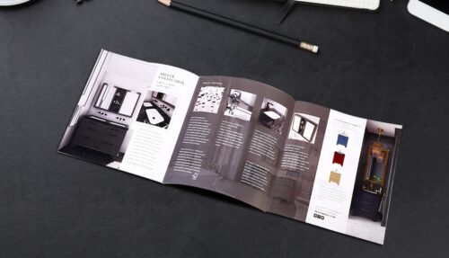
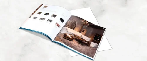
On all your flyers, brochures, catalogs, leaflets… your branded colors, logo, slogan, and style must figure large.
Branded packaging
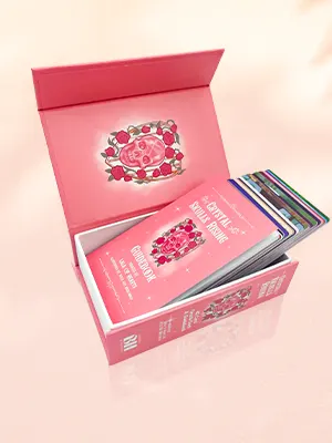
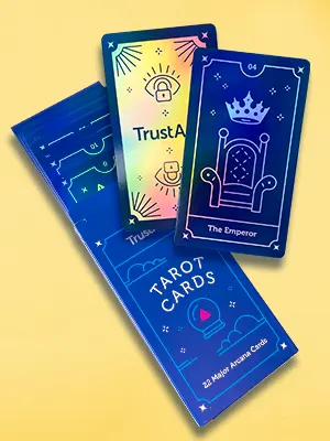
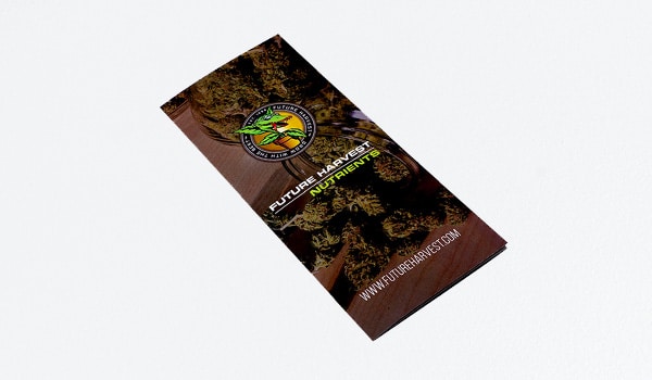
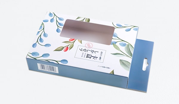
And last but not least, you do well to brand all your packaging; from product boxes, to display boxes, to mailing cartons and envelopes. Brand it all!
Talk to us today
At QinPrinting, we enjoy considerable success in the offset printing industry and have helped hundreds of brands develop unique custom-branded print materials to up their marketing game. Our expert design and printing team, coupled with state-of-the-art offset printing technology, and a real commitment to personalized customer care sustains our worldwide reputation for combining the speed, efficiency, and value for money you expect from a major international printer with the personal attention you’d want in your local print shop. Get in touch today to discuss your needs or ask us for a no-obligation quote. We’re here and happy to help.

