Brochure Printing
We offer a variety of custom brochure printing options, including fully customized designs like gatefold, accordion fold, bi-fold, tri-fold, and more. At QinPrinting, we deliver high-quality brochures with professionalism and creativity, serving businesses, non-profits, and educational institutions worldwide, while providing a range of paper stocks and finishes to fit your budget.

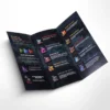
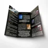


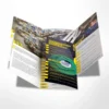
Brochure Printing Instant Quote
Brochure Fold Types & Folding Options
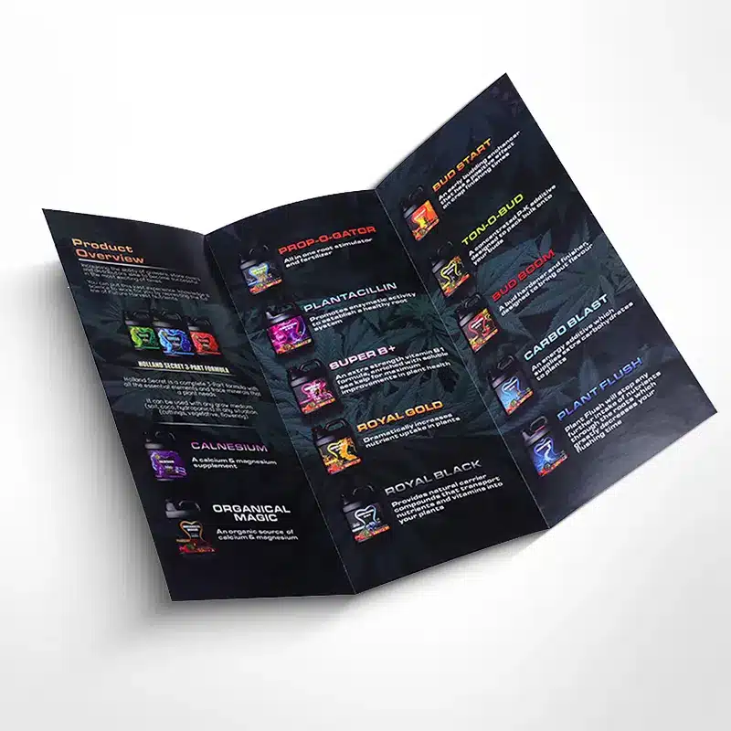
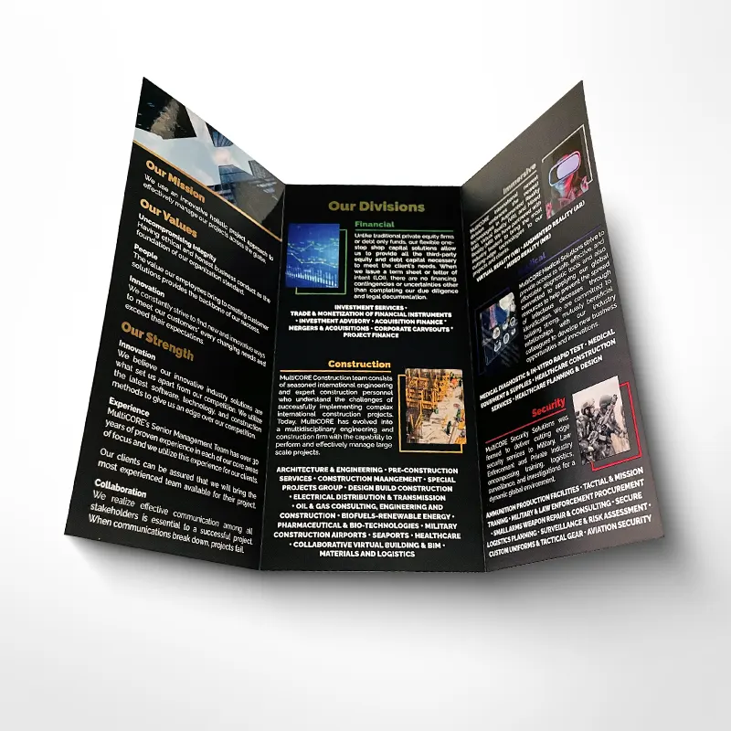
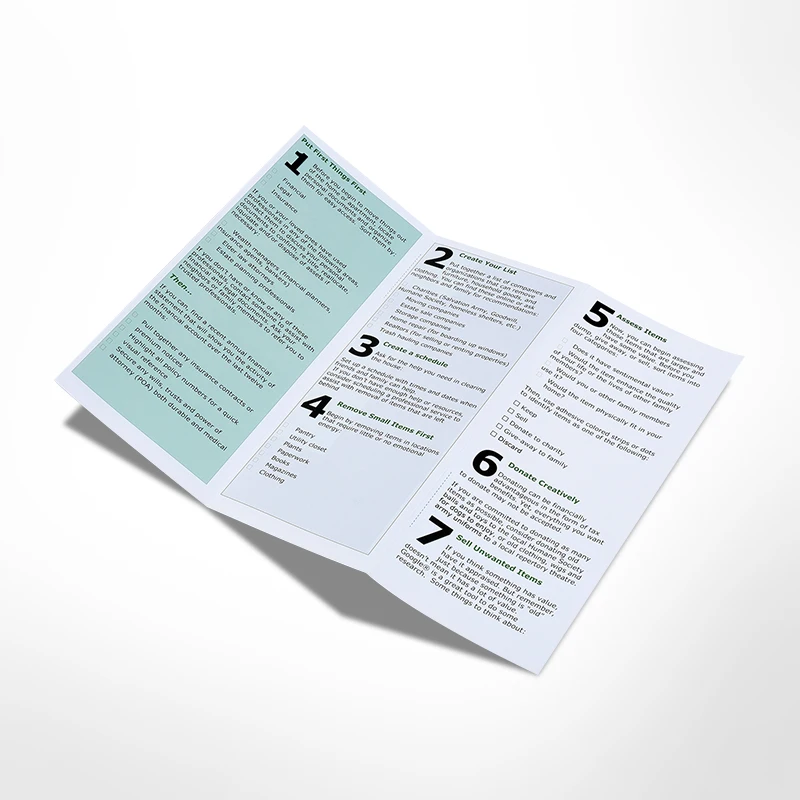
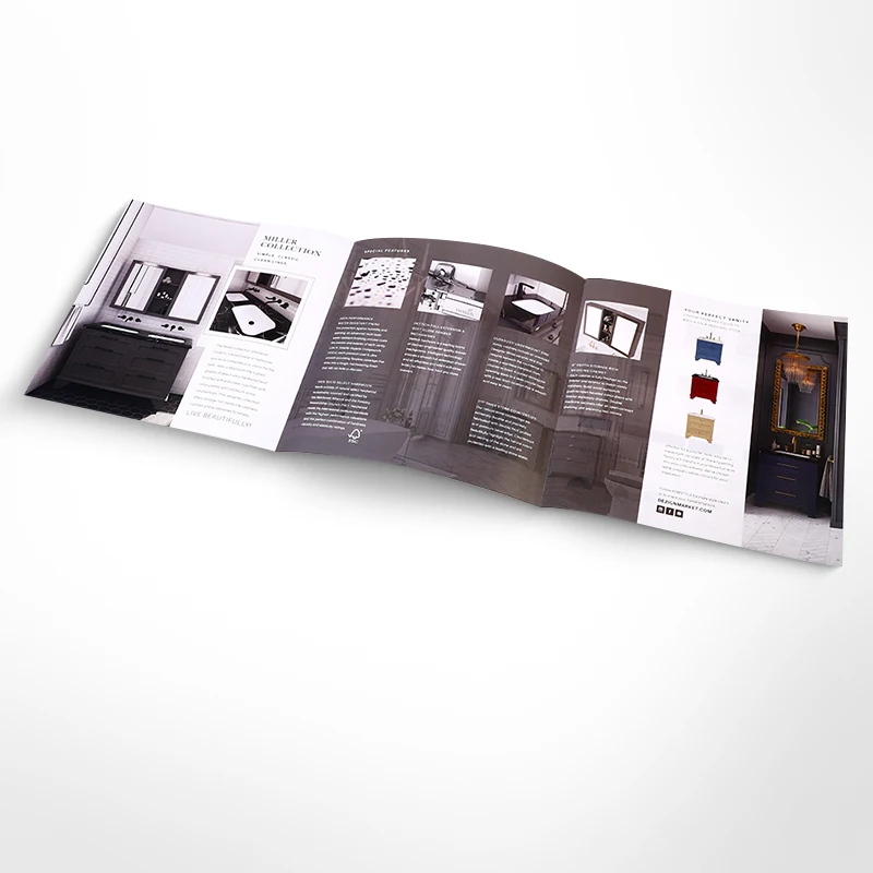
Choosing the right brochure fold is a key part of brochure printing. Your paper stock, finishing, and layout will depend on your brochure style, brochure format, and the brochure folding option you choose. With so many brochure fold types available, our team can help you select a fold that fits your content, mailing needs, and budget. Below are some of the most popular brochure folding styles we produce.

4-Page Standard Fold
A classic bi-fold brochure with one crease, creating a 4-page layout: cover, two inside pages, and back cover.
A common tri-fold brochure format. Two folds create three equal panels that fold like a standard business letter.

An accordion fold brochure (also called Z-fold style in some layouts). Panels fold back in alternating directions for easy step-by-step reading.

A roll fold brochure uses three folds to create eight panels that roll inward over each other, ideal for structured content sections.

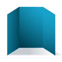
A premium-looking gate fold brochure. Two side panels fold inward like doors, revealing the center panel.

A parallel fold brochure with three folds to form eight pages, allowing panels to tuck inside neatly.

A French fold brochure is folded once horizontally and once vertically, creating a compact format with a hidden interior section.

A multi-panel fold based on the French fold principle, producing a higher page count for detailed brochure printing projects.
Looking for custom brochure folding beyond the options above? We can produce custom folded brochures in many formats—including special folds, mixed folds, and unique panel sizes—based on your design and how you plan to use the brochure (handouts, mailing, inserts, product guides, event brochures, etc.). Share your artwork or a simple mock-up, and we’ll recommend the best brochure fold type for readability and production accuracy.
Brochure Size Options
Choosing the right size is an important part of brochure printing, as it affects your layout, mailing requirements, and overall presentation. We offer a range of popular brochure sizes:
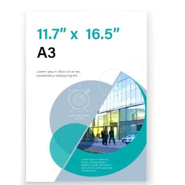
11.7 x 16.5 inches
297 x 420 mm
8.3 x 11.7 inches
210 x 297 mm
5.8 x 8.3 inches
148 x 210 mm
8.5 x 11 inches
216 x 279 mm
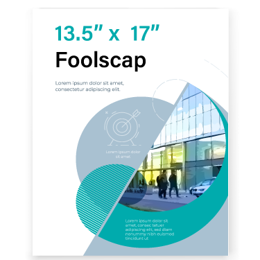
13.5 x 17 inches
343 x 432 mm
3.9 x 8.3 inches
99 x 210 mm
Need something different? We can produce custom brochure sizes for almost any project—whether you want a compact mini-brochure, a wide landscape format, or a unique size that fits your packaging, inserts, or display stands. Simply tell us:
- Finished size (width × height)
- Fold type / panel count (bi-fold, tri-fold, accordion, gatefold, etc.)
If your preferred size isn’t available in our online calculator, contact us for a custom quote—we’ll confirm the best size and folding layout for clean trimming and accurate finishing.
Paper Options for Brochures
You have many options for paper stock to print your brochure at QinPrinting. Brochures with photographs look best on gloss or matte cover paper because they have a high-quality finish which gives first-class image reproduction while uncoated paper could be fine if your brochure is mainly text. Here’s a helpful list of typical brochure papers:
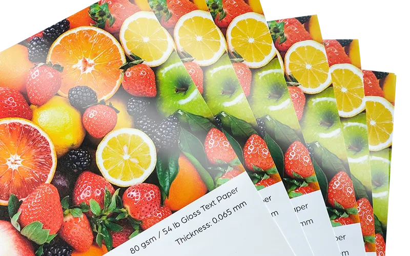
Gloss Art Paper
Bright and vibrant, perfect for illustration-heavy flyers.
Common weights:
80–157 gsm (54–106 lb text)
200–350 gsm (74–129 lb cover)
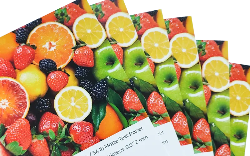
Smooth and elegant with a soft, premium sheen.
Common weights:
80–157 gsm (54–106 lb text)
200–300 gsm (74–111 lb cover)
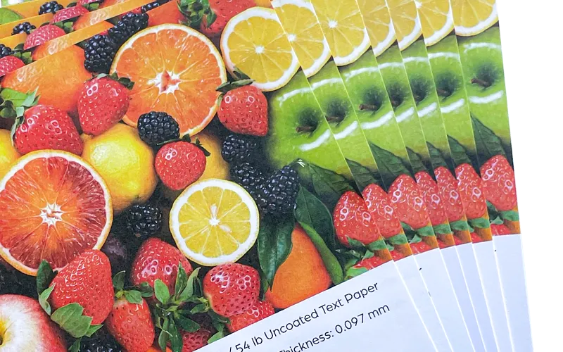
Excellent for writing and coloring, provides a natural look with no glare or coating.
Common weights:
80–180 gsm (54–122 lb text)
Finish Options
You want your brochures to make a fantastic impression. Someone browsing your stand at a trade fair, picking up a copy in-store, or sifting through their direct mail, is more likely to check it out if it’s eye-catching and distinctive. QinPrinting offers a complete range of finishing options to make your brochures unique. Among other options, the most popular choices include:
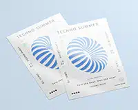
Shiny and reflective, perfect for vibrant graphics and photos.
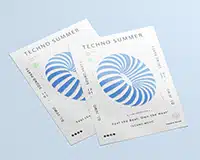
Glossy highlights on specific areas for a striking contrast.
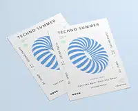
Smooth and non-reflective for a simple yet professional design.
Similar to matte lamination, but the resulting surface has a delightful, almost velvet feel.
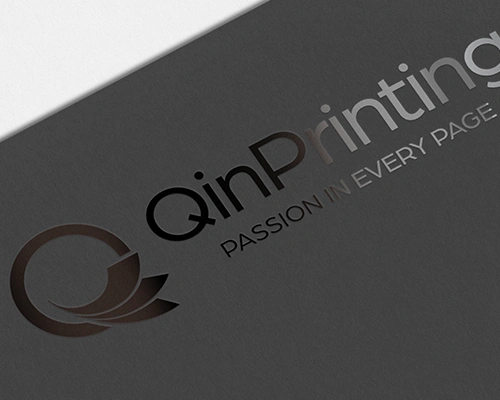
A glossy finish applied to specific areas for a bold and distinct look.
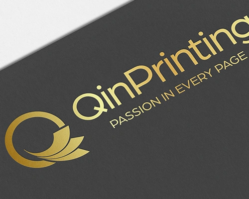
Metallic or pigmented foil for a shiny, eye-catching effect.
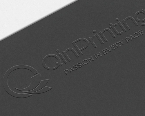
Raised designs for added texture and elegance.
Uses a custom-made metal die to cut paper into specific shapes.
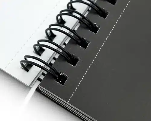
A row of small holes that makes it easy to tear off part of the paper.
If you’re not sure which option works best for your brochures, our team is always here to help you choose the most suitable materials and finishes.
Why Choose Us for Flyer Printing?

We offer some of the most competitive prices in the industry, ensuring that you get high-quality brochures without breaking your budget.

Whether you need a unique size, special paper, or a custom design, we provide complete flexibility to meet your specific needs.

No matter where you are, we can deliver your printed brochures straight to your doorstep. Our efficient shipping options ensure that your flyers reach any corner of the world.

We use advanced printing technology and premium materials, ensuring crisp, vibrant colors and excellent print quality every time.
FAQs
How much does it cost to print a brochure?
| Quantity: | 1000pcs | 2500pcs | 5000pcs | 7500pcs | 10000pcs | 20000pcs | 30000pcs |
|---|---|---|---|---|---|---|---|
| 5.5" x 8.5" | $0.135 each $135 total | $0.066 each $165 total | $0.047 each $233 total | $0.038 each $287 total | $0.034 each $337 total | $0.026 each $514 total | $0.024 each $705 total |
| 8.5" x 11" | $0.130 each $130 total | $0.069 each $172 total | $0.054 each $268 total | $0.044 each $333 total | $0.040 each $402 total | $0.032 each $635 total | $0.031 each $927 total |
| 8.5" x 14" | $0.137 each $137 total | $0.084 each $210 total | $0.067 each $334 total | $0.058 each $434 total | $0.054 each $535 total | $0.047 each $944 total | $0.046 each $1,390 total |
| 11" x 17" | $0.146 each $146 total | $0.093 each $232 total | $0.076 each $378 total | $0.066 each $498 total | $0.062 each $618 total | $0.055 each $1,099 total | $0.054 each $1,622 total |
- 128 gsm / 87 lb coated text paper, gloss lamination on the outside, full color printing
- Please note that all prices are EXW our facility and do not include shipping costs.
| Quantity: | 1000pcs | 2500pcs | 5000pcs | 7500pcs | 10000pcs | 20000pcs | 30000pcs |
|---|---|---|---|---|---|---|---|
| 5.5" x 8.5" | $0.138 each $138 total | $0.068 each $171 total | $0.049 each $246 total | $0.041 each $308 total | $0.037 each $365 total | $0.028 each $566 total | $0.026 each $783 total |
| 8.5" x 11" | $0.134 each $134 total | $0.071 each $178 total | $0.056 each $282 total | $0.047 each $353 total | $0.043 each $429 total | $0.034 each $687 total | $0.034 each $1,006 total |
| 8.5" x 14" | $0.140 each $140 total | $0.086 each $216 total | $0.069 each $347 total | $0.061 each $454 total | $0.056 each $562 total | $0.050 each $997 total | $0.049 each $1,469 total |
| 11" x 17" | $0.150 each $150 total | $0.096 each $239 total | $0.078 each $392 total | $0.069 each $518 total | $0.065 each $646 total | $0.058 each $1,151 total | $0.057 each $1,701 total |
- 128 gsm / 87 lb coated text paper, gloss lamination on the outside, full color printing
- Please note that all prices are EXW our facility and do not include shipping costs.
What is the minimum order quantity for brochure printing?
Our minimum order quantity for brochures printing is 100 pieces. We cater to both small and large orders, so whether you need a small batch for a local event or a larger quantity for a marketing campaign, we’ve got you covered.
Can I choose a custom size for my brochures?
Absolutely! We offer fully customizable sizes to suit your specific needs. Whether you need a standard size or a unique dimension, simply let us know your requirements, and we’ll make it happen.
How long will it take to print and deliver my brochures?
Production typically takes 3-5 days. Delivery times vary by location, but we offer global shipping, ensuring your flyers reach you.
Do you provide file checking services?
Yes, we provide free manual file checking to ensure your files meet the printing requirements.
Which file types can I send?
Please submit your design in PDF format with the following specifications:
- 3mm (0.125 inch) bleed on all sides
- CMYK color mode for accurate color printing
- Fonts must be embedded in the PDF
This ensures your design prints as expected.
Can you ship brochures internationally?
Yes, we provide international shipping to most countries around the world.
QinPrinting Reviews
I collected memories from 100 friends and family members, and added to it , along with 250 photos.
I had a quote from Mia at QinPrinting and was so impressed with the efficient communication and excellent price. I decided to go for it, despite my concerns about delivery and turn around.
Mia was amazing throughout the process and everything happened just as she said. The printing of 200 A4 books with 200 pages was completed within the week. The order arrived within a week of dispatch. I was so impressed with the quality. The books were given out at the memorial last weekend and everyone loves them ! Thank you so much for the excellent services. If anyone is thinking about it , I would say - I can 100% recommend - a fantastic company and a wonderful book !!! Thank you
Printing was top quality.
Let's talk!
For the best pricing, highest quality, and quickest turnaround-time on any type or style of brochure, printing with us is always a good business decision.


